React Forms: Difference between revisions
| (11 intermediate revisions by the same user not shown) | |||
| Line 14: | Line 14: | ||
*Formats the input data e.g. dates 25-03-2001 | *Formats the input data e.g. dates 25-03-2001 | ||
==Example using UseState== | ==Example using UseState== | ||
<syntaxhighlight lang=" | <syntaxhighlight lang="jsx"> | ||
const [password, setPassword] = useState(""); | const [password, setPassword] = useState(""); | ||
... | ... | ||
| Line 44: | Line 44: | ||
... | ... | ||
</syntaxhighlight> | </syntaxhighlight> | ||
==Using React Components== | ==Using React Components== | ||
<syntaxhighlight lang=" | <syntaxhighlight lang="jsx"> | ||
import React from "react"; | import React from "react"; | ||
| Line 68: | Line 69: | ||
} | } | ||
</syntaxhighlight> | </syntaxhighlight> | ||
=Uncontrolled Forms= | =Uncontrolled Forms= | ||
==Introduction== | ==Introduction== | ||
| Line 75: | Line 77: | ||
*Extract value using the reference created in the constructor | *Extract value using the reference created in the constructor | ||
==Example== | ==Example== | ||
<syntaxhighlight lang=" | <syntaxhighlight lang="jsx"> | ||
import React from "react"; | import React from "react"; | ||
| Line 105: | Line 107: | ||
</syntaxhighlight> | </syntaxhighlight> | ||
==When to Use== | ==When to Use== | ||
*For read-only elements like file input | *For read-only elements like file input | ||
*When using a non-react library | *When using a non-react library | ||
*To reduce re-rending form in a complex DOM | *To reduce re-rending form in a complex DOM | ||
==Using | ==Using useForm Hook== | ||
*Uses uncontrolled elements | *Uses uncontrolled elements | ||
*Therefore minimizes re-rendering | *Therefore minimizes re-rendering | ||
*Works with Controlled components & UI libraries | *Works with Controlled components & UI libraries | ||
*Provides Validation helpers and support for schema validators | *Provides Validation helpers and support for schema validators | ||
==Example | |||
==Example useForm Hook== | |||
*Import the hook | *Import the hook | ||
*Get props from hook | *Get props from hook | ||
| Line 140: | Line 144: | ||
export default TestReactHookForm; | export default TestReactHookForm; | ||
</syntaxhighlight> | </syntaxhighlight> | ||
==Validation with useForm== | ==Validation with useForm== | ||
We can pass the standard HTML validation when we register the field. Any HTML validation can be used. e.g. min or max | We can pass the standard HTML validation when we register the field. Any HTML validation can be used. e.g. min or max | ||
| Line 150: | Line 155: | ||
{ resolver: yupResolver(schema)}) | { resolver: yupResolver(schema)}) | ||
} | } | ||
</syntaxhighlight> | |||
==Watch with useFrom== | |||
This will watch specified inputs and return their values. It is useful for determining what to render. | |||
<syntaxhighlight lang="jsx"> | |||
import React from "react"; | |||
import { useForm } from "react-hook-form"; | |||
function App() { | |||
const { register, watch, formState: { errors }, handleSubmit } = useForm(); | |||
const watchShowAge = watch("showAge", false); // you can supply default value as second argument | |||
const watchAllFields = watch(); // when pass nothing as argument, you are watching everything | |||
const watchFields = watch(["showAge", "number"]); // you can also target specific fields by their names | |||
const onSubmit = data => console.log(data); | |||
return ( | |||
<> | |||
<form onSubmit={handleSubmit(onSubmit)}> | |||
<input type="checkbox" {...register("showAge")} /> | |||
{/* based on yes selection to display Age Input*/} | |||
{watchShowAge && <input type="number" {...register("age", { min: 50 })} />} | |||
<input type="submit" /> | |||
</form> | |||
</> | |||
); | |||
} | |||
</syntaxhighlight> | </syntaxhighlight> | ||
| Line 174: | Line 207: | ||
==Formik Using Components== | ==Formik Using Components== | ||
This is the example with components. This now been re-implemented using hooks. It does use styled components around the controls which I personally found to be a bit hard to debug. | This is the example with components. This now been re-implemented using hooks. It does use styled components around the controls which I personally found to be a bit hard to debug. | ||
<syntaxhighlight lang=" | <syntaxhighlight lang="jsx"> | ||
import React from "react"; | import React from "react"; | ||
import styled from "styled-components"; | import styled from "styled-components"; | ||
| Line 312: | Line 345: | ||
export default LoginFormik; | export default LoginFormik; | ||
</syntaxhighlight> | </syntaxhighlight> | ||
=Formik Validation= | =Formik Validation= | ||
Formik provides two types of validation and they are not a surprise | Formik provides two types of validation and they are not a surprise | ||
| Line 318: | Line 352: | ||
==Field Level== | ==Field Level== | ||
Note the returning of undefined '''not''' null | Note the returning of undefined '''not''' null | ||
<syntaxhighlight lang=" | <syntaxhighlight lang="jsx"> | ||
... | ... | ||
class LoginFormik extends React.Component { | class LoginFormik extends React.Component { | ||
| Line 389: | Line 423: | ||
</syntaxhighlight> | </syntaxhighlight> | ||
For on a field level | For on a field level | ||
<syntaxhighlight lang=" | <syntaxhighlight lang="jsx"> | ||
static validatePassword(value) { | static validatePassword(value) { | ||
let error; | let error; | ||
| Line 400: | Line 434: | ||
} | } | ||
</syntaxhighlight> | </syntaxhighlight> | ||
=useField Hook= | =useField Hook= | ||
==Input== | ==Input== | ||
| Line 493: | Line 528: | ||
=Formik with Functional Components= | =Formik with Functional Components= | ||
Here is the sample from the Formik help showing how to make a similar form with the Formik hooks. The documentation is pretty good. | Here is the sample from the Formik help showing how to make a similar form with the Formik hooks. The documentation is pretty good. | ||
<syntaxhighlight lang=" | <syntaxhighlight lang="jsx"> | ||
import React from 'react'; | import React from 'react'; | ||
import { Formik } from 'formik'; | import { Formik } from 'formik'; | ||
| Line 554: | Line 589: | ||
</syntaxhighlight> | </syntaxhighlight> | ||
Usage of this would look like this where we are passing a label to always be associated with the field. | Usage of this would look like this where we are passing a label to always be associated with the field. | ||
<syntaxhighlight lang=" | <syntaxhighlight lang="jsx"> | ||
<TestTextInput | <TestTextInput | ||
label="First Name" | label="First Name" | ||
Latest revision as of 01:30, 12 July 2021
Introduction
- Controlled Forms
- Uncontrolled Forms
- Using Formik Library
- Validation
- Creating reusable custom form elements
- Uncontrolled forms using React
- React Hook Form to create uncontrolled forms
Controlled forms
In react we can pass state management to the react component. This is what a controlled form is. It's advantages are
- Instant Feedback
- Disable controls dynamically
- Formats the input data e.g. dates 25-03-2001
Example using UseState
  const [password, setPassword] = useState("");
...
      <Form onSubmit={handleSubmit} className="row g-3 needs-validation">
        <div>
          <div className="col-md-4">
            <Form.Group size="lg" controlId="password">
              <Form.Label>Password</Form.Label>
              <Form.Control
                type="password"
                value={password}
                onChange={(e) => onPasswordChange(e)}
              />
              <div className="invalid-feedback">{passwordError}</div>
              <div className="valid-feedback">Password looks good!</div>
            </Form.Group>
          </div>
        </div>
        <div>
          <div className="col-12">
            <Button
              type="submit"
              className="btn btn-primary"
              disabled={isSubmitting || !formValid}
            >{`${isSubmitting ? "Logging In" : "Login"}`}</Button>
          </div>
        </div>
      </Form>
...
Using React Components
import React from "react";

class EmailForm extends React.Component {
    constructor(props) {
        super(props);
    }
    this.state = {value: ''};
    this.handleChange = this.handleChange.bind(this);

    handleChange(event) {
        this.setState({value: event.target.value});
    }

    render() {
        return (
            <form>
                <input type="email" value={this.state.value} onChange={this.handleChange} />
            </form>
        );
    }
}
Uncontrolled Forms
Introduction
Uncontrolled forms are when the DOM maintains the states and a reference is stored to it in react. To use an uncontrolled Form you need to
- Create a reference using React.createRef()
- Assign reference using ref prop on form element
- Extract value using the reference created in the constructor
Example
import React from "react";

class TestForm extends React.Component {
  constructor(props) {
    super(props);
    this.submit = this.submit.bind(this);

    this.input = React.createRef();
  }

  submit(event) {
    // eslint-disable-next-line no-alert
    alert(`Value${this.input.current.value}`);
    event.preventDefault();
  }

  render() {
    return (
      <form onSubmit={this.submit}>
        <input type="text" ref={this.input} />
        <input type="submit" value="Submit" />
      </form>
    );
  }
}

export default TestForm;
When to Use
- For read-only elements like file input
- When using a non-react library
- To reduce re-rending form in a complex DOM
Using useForm Hook
- Uses uncontrolled elements
- Therefore minimizes re-rendering
- Works with Controlled components & UI libraries
- Provides Validation helpers and support for schema validators
Example useForm Hook
- Import the hook
- Get props from hook
- Set the callback to envoke if validation does fail on submit
- Set the forms handleSubmit function
- Register the input tag with a name
- If errors render them
import {useForm} from "react-hook-form";

export default App() {
    const {register, handleSubmit, errors} = useForm()

    const mySubmit = data => console.log(`Add validation on submit here ${data}`)

    return (
        <form onSubmit={handleSubmit(mySubmit)}>
            <input {...register("email")} />
            {errors.email && <span>this field is required</span>}
            <input type="submit" />
        </form>
    )
}

export default TestReactHookForm;
Validation with useForm
We can pass the standard HTML validation when we register the field. Any HTML validation can be used. e.g. min or max
<input {...register("email", {required: "error messsage"})} />
We can also use a schema by installing the appropriate resolver e.g. yup resolver and setting the schema to use when we define the useForm hook
    const {register, handleSubmit, errors} = useForm({
       { resolver: yupResolver(schema)})
    }
Watch with useFrom
This will watch specified inputs and return their values. It is useful for determining what to render.
import React from "react";
import { useForm } from "react-hook-form";

function App() {
  const { register, watch, formState: { errors }, handleSubmit } = useForm();
  const watchShowAge = watch("showAge", false); // you can supply default value as second argument
  const watchAllFields = watch(); // when pass nothing as argument, you are watching everything
  const watchFields = watch(["showAge", "number"]); // you can also target specific fields by their names

  const onSubmit = data => console.log(data);

  return (
    <>
      <form onSubmit={handleSubmit(onSubmit)}>
        <input type="checkbox" {...register("showAge")} />

        {/* based on yes selection to display Age Input*/}
        {watchShowAge && <input type="number" {...register("age", { min: 50 })} />}

        <input type="submit" />
      </form>
    </>
  );
}
Using Formik Library
Advantages
This is what is suggests.
- Reduces Verbosity
- Reduces code for state and callbacks
- Reduces errors
- Tracks values, errors and visited fields
- Hooks up appropriate callback functions
- Helpers for sync and async validation and showing errors
- Sensible defaults
Components of Formik
Here are the components which make up a Formik form. The first being the component responsible for controlling the form
- Formik
- Form
- Field
- ErrorMessage
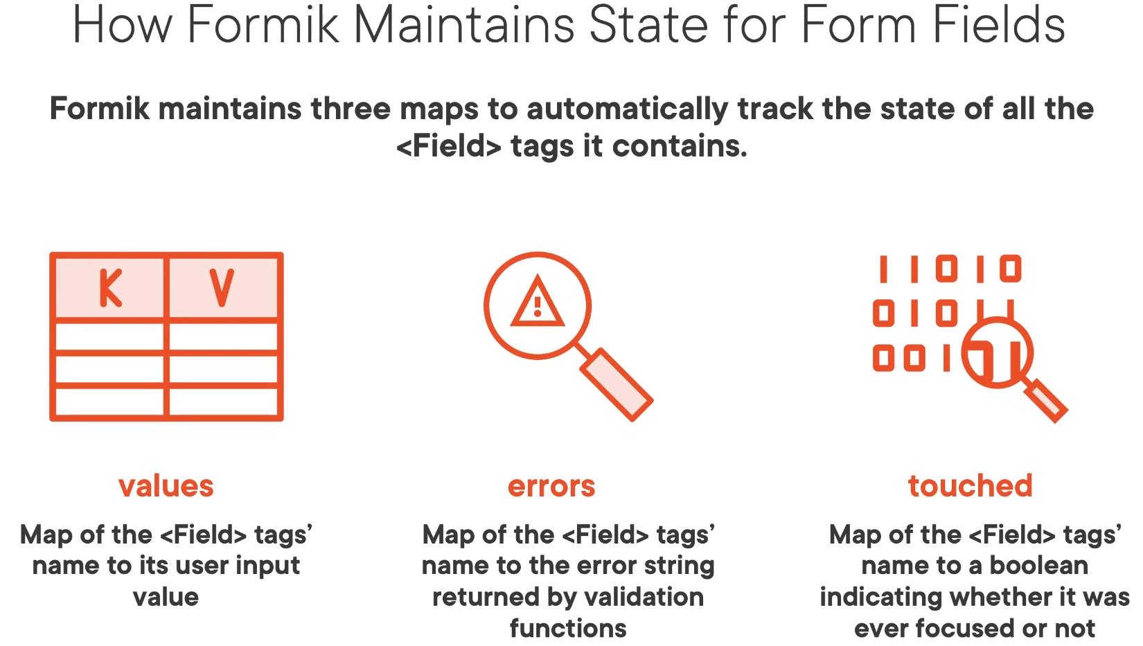
Internally Formik maintains three maps.

Formik Using Components
This is the example with components. This now been re-implemented using hooks. It does use styled components around the controls which I personally found to be a bit hard to debug.
import React from "react";
import styled from "styled-components";
import { Formik, Field, Form, ErrorMessage } from "formik";

const SigninForm = styled(Form)`
  display: flex;
  flex-direction: column;
  padding: 30px;
  border: 1px solid black;
`;

const Container = styled.div`
  display: flex;
  flex-direction: column;
  flex: 1;
  height: 100%;
  align-items: center;
`;

const ContentContainer = styled.div`
  display: flex;
  flex-direction: column;
  width: 600px;
  margin-top: 50px;
`;

const Title = styled.h1`
  white-space: pre-line;
`;

const Label = styled.label`
  margin-top: 20px;
  font-size: 24px;
`;

const EmailField = styled(Field)`
  height: 40px;
  font-size: 24px;
`;

const ErrorLabel = styled.div`
  color: red;
  font-size: 26px;
`;

const PasswordField = styled(Field)`
  height: 40px;
  font-size: 24px;
`;

const CheckboxContainer = styled.div`
  display: flex;
  height: 50px;
  align-items: center;
`;

const RememberMeCheckboxField = styled(Field)`
  margin-top: 10px;
`;

const CheckboxLabel = styled(Label)`
  margin-top: 7px;
  margin-left: 10px;
`;

class LoginFormik extends React.Component {
  constructor(props) {
    super(props);

    this.handleSubmit = LoginFormik.handleSubmit.bind(this);
    this.handleValidation = LoginFormik.handleValidation.bind(this);
  }

  static handleSubmit(values) {
    return new Promise((resolve) => {
      setTimeout(() => {
        resolve();
        // eslint-disable-next-line no-alert
        alert(JSON.stringify(values));
      }, 5000);
    });
  }

  static handleValidation(values) {
    const errors = {};

    if (!values.email) {
      errors.email = "Email cannot be empty";
    }

    if (!values.password) {
      errors.password = "Password cannot be empty";
    } else if (values.password.length < 8) {
      errors.password = "Password must be at least 8 characters";
    }
    return errors;
  }

  render() {
    return (
      <Container>
        <ContentContainer>
          <Title>Signin Form</Title>

          <Formik
            initialValues={{ email: "", password: "", rememberMe: false }}
            onSumbit={this.handleSumbit}
            validate={this.handleValidation}
          >
            {() => (
              <SigninForm>
                <Label>Email</Label>
                <EmailField name="email" type="email" />
                <ErrorMessage name="email">
                  {(error) => <ErrorLabel>{error}</ErrorLabel>}
                </ErrorMessage>

                <Label>Password</Label>
                <PasswordField name="password" type="password" />
                <ErrorMessage name="password">
                  {(error) => <ErrorLabel>{error}</ErrorLabel>}
                </ErrorMessage>

                <CheckboxContainer>
                  <RememberMeCheckboxField type="checkbox" name="rememberMe" />
                  <CheckboxLabel>Remember Me</CheckboxLabel>
                </CheckboxContainer>
              </SigninForm>
            )}
          </Formik>
        </ContentContainer>
      </Container>
    );
  }
}
export default LoginFormik;
Formik Validation
Formik provides two types of validation and they are not a surprise
- Field level
- Form level
Field Level
Note the returning of undefined not null
...
class LoginFormik extends React.Component {
  static validatePassword(value) {
    if (!value) {
      return "Password cannot be empty";
    }
    if (value.length < 5) {
      return "Very Weak";
    }
    if (value.length < 8) {
      return "Weak";
    }
    return undefined;
  }
...
                <Label>Password</Label>
                <PasswordField
                  name="password"
                  type="password"
                  validate={LoginFormik.validatePassword}
                />
Form Level
This is done by defining a function on the Formik validate property.
          <Formik
            initialValues={{ email: "", password: "", rememberMe: false }}
            onSumbit={this.handleSumbit}
            validate={this.handleValidation}
Formik Schema Validation (e.g. yup)
Introduction
Define the field, the error conditions and the error.
const schema = Yup.object().shape({
    name: Yup.string()
     .min(2, 'Too Short!')
     .max(50, 'Too Long!')
     .required('Required'),

    email: Yup.string()
     .email('Invalid email')
     .required('Required'),
})
Implementation in code
The password validation can be done with
import * as Yup from "yup";
...
const passwordSchema = Yup.object().shape({
  password: Yup.string()
    .required("Password cannot be empty")
    .test("len", "Very Weak", (val) => val.length > 5)
    .test("len", "Weak", (val) => val.length > 8),
});
Implementation in JSX
We can use the schema either directly from the Formik
  <Formik
    initialValues={{ email: "", password: "", rememberMe: false }}
    onSumbit={this.handleSumbit}
    validationSchema={PasswordSchema}
  >
For on a field level
  static validatePassword(value) {
    let error;
    try {
      passwordSchema.validateSync({ password: value });
    } catch (validationError) {
      [error] = validationError.errors;
    }
    return error;
  }
useField Hook
Input
useField hook accepts as input
- a field name string
- a props object A list of props you want to be able to set on the field. E.g. label.
// passing a name like email
const [field, meta, helpers] = useField('email');
// passing a props object
 const MyTextField = ({ label, ...props }) => {
   const [field, meta, helpers] = useField(props);
   return (
     <>
       <label>
         {label}
         <input {...field} {...props} />
       </label>
       {meta.touched && meta.error ? (
         <div className="error">{meta.error}</div>
       ) : null}
     </>
   );
 };
Output
It returns an array of
- FieldInputProps
- FieldMetaProps
- FieldHelperProps
FieldInputProps
Key values are
- name
- value
- checked, multiple
- onBlur, onChange
FieldMetaProps
Contains computed meta data.
- error
- touched
- value
initialValue
FieldHelperProps
Contains methods for updating the value, touched or error status for the field. This can be done but using the
- setValue
- setTouched
- setError
These
Example 1
In this example we pass label as a prop to the useField.
/* eslint-disable react/jsx-props-no-spreading */
import React from "react";
import PropTypes from "prop-types";

import { useField } from "formik";

// Note passing the non-standard prop label separately.
const TestTextInput = ({ label, ...props }) => {
  // Get the default field and meta props
  const [field, meta] = useField(props);

  // Add our label to the JSX
  // Pass the field and props to the input
  // Manage the display of the error
  return (
    <>
      <label htmlFor={props.name}>{label}</label>
      <input {...field} {...props} />
      {meta.touched && meta.error ? <div>{meta.error}</div> : null}
    </>
  );
};

TestTextInput.propTypes = {
  label: PropTypes.string,
  name: PropTypes.string.isRequired,
};

TestTextInput.defaultProps = {
  label: null,
};

export default TestTextInput;
Example 2
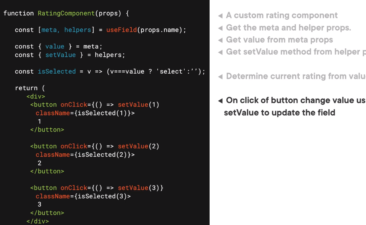
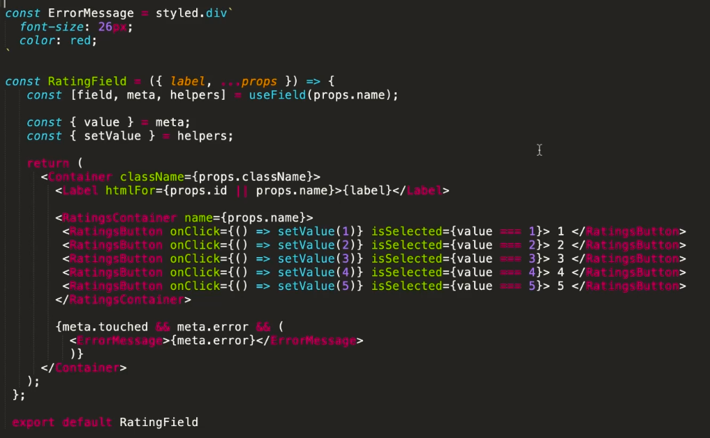
Here is a rating button example.

An below is the usage of this field.

Formik with Functional Components
Here is the sample from the Formik help showing how to make a similar form with the Formik hooks. The documentation is pretty good.
 import React from 'react';
 import { Formik } from 'formik';
 import * as Yup from 'yup';

 const SignupForm = () => {
   return (
     <Formik
       initialValues={{ firstName: '', lastName: '', email: '' }}
       validationSchema={Yup.object({
         firstName: Yup.string()
           .max(15, 'Must be 15 characters or less')
           .required('Required'),
         lastName: Yup.string()
           .max(20, 'Must be 20 characters or less')
           .required('Required'),
         email: Yup.string().email('Invalid email address').required('Required'),
       })}
       onSubmit={(values, { setSubmitting }) => {
         setTimeout(() => {
           alert(JSON.stringify(values, null, 2));
           setSubmitting(false);
         }, 400);
       }}
     >
       {formik => (
         <form onSubmit={formik.handleSubmit}>
           <label htmlFor="firstName">First Name</label>
           <input
             id="firstName"
             type="text"
             {...formik.getFieldProps('firstName')}
           />
           {formik.touched.firstName && formik.errors.firstName ? (
             <div>{formik.errors.firstName}</div>
           ) : null}

           <label htmlFor="lastName">Last Name</label>
           <input
             id="lastName"
             type="text"
             {...formik.getFieldProps('lastName')}
           />
           {formik.touched.lastName && formik.errors.lastName ? (
             <div>{formik.errors.lastName}</div>
           ) : null}

           <label htmlFor="email">Email Address</label>
           <input id="email" type="email" {...formik.getFieldProps('email')} />
           {formik.touched.email && formik.errors.email ? (
             <div>{formik.errors.email}</div>
           ) : null}

           <button type="submit">Submit</button>
         </form>
       )}
     </Formik>
   );
 };
Usage of this would look like this where we are passing a label to always be associated with the field.
<TestTextInput
   label="First Name"
   name="firstname"
   type="text"
   placeholder="jane"
/>