Android Material Design: Difference between revisions
| Line 59: | Line 59: | ||
*Primary Dark | *Primary Dark | ||
*Accent (Secondary Colour) | *Accent (Secondary Colour) | ||
*Color Control High | |||
*Color Button | |||
*Control Activated | |||
=Toolbar= | |||
*Action Bar can be replaced with Toolbar | |||
*Inherit from ViewGroup and therefore can be placed anywhere | |||
*Compatible with API 7 onwards | |||
To keep backward comparability we use the include tag in the activity so they application pick the layout from the appropriate folder. | |||
<syntaxhighlight lang="xml"> | |||
<LinearLayout | |||
xmlns:android="http://schemas.android.com/apk/res/android" | |||
xmlns:tools="http://schemas.android.com/tools" | |||
android:layout_width="match_parent" | |||
android:layout_height="match_parent" | |||
android:orientation="vertical"> | |||
<include | |||
android:id="@+id/toolbar" | |||
layout="@layout/toolbar"/> | |||
</syntaxhighlight lang="xml"> | |||
Revision as of 00:48, 23 December 2020
Basics
The theme is defined in the styles.xml. You have to make sure the minSdkVersion is compatible with the theme. The backward compatible themes without Material Design is
Theme.AppCompat
Theme.AppCompat.Light
Theme.AppCompat.Light.DarkActionBar
Theme.AppCompat.Light.NoActionBar
The equivalent Material Themes are
android.style/Theme.Material
android.style/Theme.Material.Light
android.style/Theme.Material.Light.DarkActionBar
android.style/Theme.Material.Light.NoActionBar
To support older phones we are required to provide a drawable-v21, values-v21 and layout-v21 if we want to be backward compatible.
To implement this we create our styles.xml with a Parent theme which could be thought of as an abstract class.
<resources>
        <!-- Base application theme. -->
        <style name="MaterialTheme" parent="ParentMaterialTheme">
                <!-- Customize your theme here. -->
        </style>

        <style name="ParentMaterialTheme" parent="Theme.AppCompat.Light.NoActionBar">

         <!-- Parent theme For all Pre - lollipop and lollipop above versions i.e. For all devices -->
                <item name="colorPrimary">@color/colorPrimary</item>
                <item name="colorPrimaryDark">@color/colorPrimaryDark</item>
                <item name="colorAccent">@color/colorAccent</item>
        </style>
...
In the styles-v21 in the folder we then have
<?xml version="1.0" encoding="utf-8"?>
<resources>
        <style name="MaterialTheme" parent="ParentMaterialTheme">
                <!-- Customize for only Lollipop and above versions such as Marshmallow device features -->
        </style>
</resources>
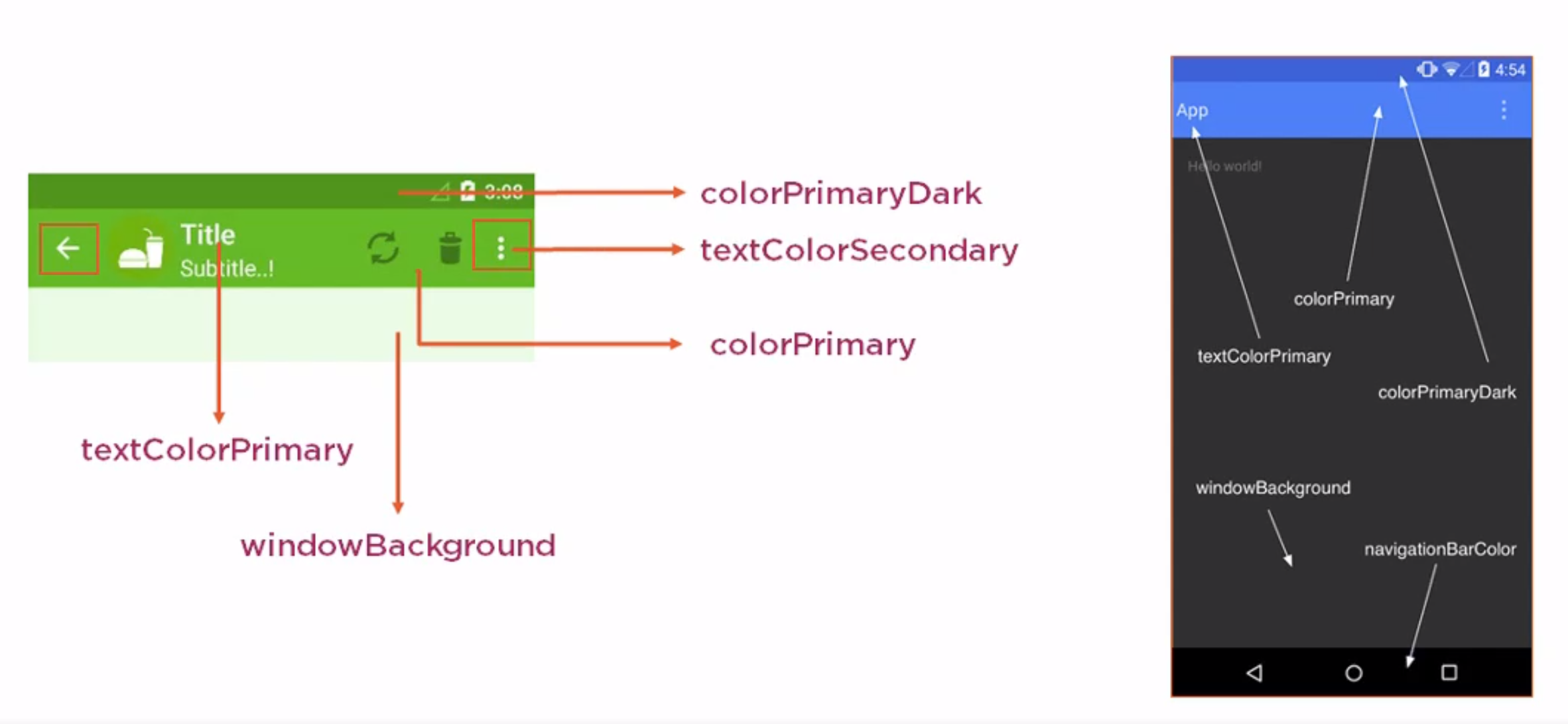
Colours
Here are some basic colour pallets for android
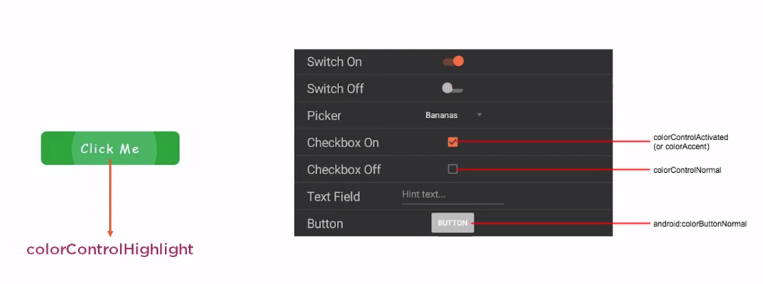
 And for the controls
 We can find useful guides on https://material.io/design/color/the-color-system.html#color-theme-creation.
Generally you choose these colours.
- Primary
- Primary Dark
- Accent (Secondary Colour)
- Color Control High
- Color Button
- Control Activated
Toolbar
- Action Bar can be replaced with Toolbar
- Inherit from ViewGroup and therefore can be placed anywhere
- Compatible with API 7 onwards
To keep backward comparability we use the include tag in the activity so they application pick the layout from the appropriate folder. <syntaxhighlight lang="xml"> <LinearLayout
       xmlns:android="http://schemas.android.com/apk/res/android"
       xmlns:tools="http://schemas.android.com/tools"
       android:layout_width="match_parent"
       android:layout_height="match_parent"
       android:orientation="vertical">
       <include
               android:id="@+id/toolbar"
               layout="@layout/toolbar"/>
</syntaxhighlight lang="xml">