Css
Introduction
Selectors
Simple Selector
The body is known as the simple selector and the background-color:#cccc99; is the property name and value
body {
    background-color:#cccc99;
}
id Selector
#myid {
    background-color:#cccc99;
}
class Selector
.myClass {
    font-style:italic;
}
You can group selector with a comma.
h1,h2 {
    background-color:#cccc99;
}
descendant selector
This will only effect the
elements below a div tag.
div p {
   background-color:#ddddaa;
}
child selector
This will only effect the child and not descendant
elements below a div tag.
div > p {
   background-color:#ddddaa;
}
<div>
  <form>
    <p>I'm a descendant but not a child</p>
  </form>
  <p>I'm a child</p>
</div>
attribute selector
This will only effect if the attribute matches.
img[alt=spacer] {
   padding:0px;
}
<img src="gradient.jpg" alt="spacer">
psuedo selector
This will only effect if the pseudo is true.
a:visited {color: #dddddd; }
other selectors
There are many other selectors. Here is an example.
ul: li:nth-child(3)
{
   background-color: #cccc99;
}
This sets the 3 child of the list to have background of #cccc99
Specifying CSS Property Values
- keywords
- thing, thick, larger
- Physical measurements
- inches (in), points (pt), picas(pc)
- Screen measurements
- pixels
- Relative measurements
- %, em
- Color codes
- #rrggbb, rbg(r,g,b)
- Fonts
- Helvetica, sans-serif
- Functional notation
- rgb(r,g,b), url("http://test.com")
Cascading and Inheritance
Ordering rules
Rules last applied based on last read. I.E. in this case paragraphs will be Green
p
{
  background-color:Gray;
}

p
{
  background-color:Green;
}
Developer Tools
Chrome shows the user agent stylesheet as well as your stylesheet
CSS Reset Stylesheet
This can be used to reset to styles regardless of browser to reset.
Specificity
This is the number associated with the rule. The highest rule is the rule which is applied.
- A Count of ID selectors
- B Count of class and attribute selectors
- C Count of type selectors
So
*                 /* a=0 b=0 c=0 -> specificity =     0  */
LI                /* a=0 b=0 c=1 -> specificity =     1  */
UL LI             /* a=0 b=0 c=2 -> specificity =     2  */
LI.red            /* a=0 b=1 c=1 -> specificity =    11  */
#content          /* a=1 b=0 c=0 -> specificity =    100 */
Generally a more specific rule takes presidence. In devtools the styles appear in specificity order
Inheritance
Some properties are inherited when you use markup but some are not. Checkout [1] for details
CSS and the Box Model
The Big Three
- Margin (distance from outside to border)
- Border (border itself)
- Padding (distance from border to inside)
Vertical Margins
The vertical margins collapse on top of each other to be the margin of one of the items. E.g. in a list if the list item margin is 5px, the distance between list items will be 5px not 5px for the top item bottom edge and 5px for the item below top edge.
Width
Width is the content size of the item and does not include the margins. Metrics within developer tools shows the calculation.
Display and Visibility
- Display is generally block, inline, or none
- Block elements sit on top of each other
- Inline elements only move downward when there is not enough space
- Display of none removes an element along with the space
- Visibility
- Hidden elements are not visible but reserves the space
Styling Text with CSS
Font Families
CSS defines five font categories
- serif, e.g. Times New Roman
- sans-serif e.g. Arial
- cursive, e.g. Comic Sans
- fantasy, e.g. Impact
- monospace, e.g. Courier New
You use the font-family to specify this. You can specify a list of fonts and it will use the first match
p
{
  font-family:Arial, Helvetica, sans-serif
}
Font Sizes
You can use em which will scale the font from the default. 2em is 2 times the size of the default.
Positioning
Element Types
There are two types of elements, inline and block elements. Inline elements by default position along the line, block elements are stacked
Block Elements
 * <address>
 * <article>
 * <aside>
 * <blockquote>
 * <canvas>
 * <dd>
 * <div>
 * <dl>
 * <dt>
 * <fieldset>
 * <figcaption>
 * <figure>
 * <footer>
 * <form>
 * <h1>-<h6>
 * <header>
 * <hr>
 * <li>
 * <main>
 * <nav>
 * <noscript>
 * <ol>
 * <p>
 * <pre>
 * <section>
 * <table>
 * <tfoot>
 * <ul>
 * <video>
Inline Elements
 * <a>
 * <abbr>
 * <acronym>
 * <b>
 * <bdo>
 * <big>
 * <br>
 * <button>
 * <cite>
 * <code>
 * <dfn>
 * <em>
 * <i>
 * <img>
 * <input>
 * <kbd>
 * <label>
 * <map>
 * <object>
 * <output>
 * <q>
 * <samp>
 * <script>
 * <select>
 * <small>
 * <span>
 * <strong>
 * <sub>
 * <sup>
 * <textarea>
 * <time>
 * <tt>
 * <var>
Relative Positioning
Relative positioning changes the position relatively from where the item would have been.
#buttons input:last-child
{
   position:relative
   top: 20px
   left: 50px
}
Relative Positioning
Relative positioning changes the position relatively from where the item would have been.
#buttons input:last-child
{
   position:relative
   top: 20px
   left: 50px
}
Absolute and Fixed Positioning
Absolute positioning puts the item exactly where requested. Fixed positioning is the same except it remains in that position even when you scroll the page.
Float and Clear
For inline elements float allows other elements to float up against the them. Clear stops this occurring
#figure1
{
   float:left
}
Bootstrep
Quick Stuff
- p-x padding (padding all four)
- m-x margin (padding all four)
- rounded (rounded courners)
Layouts
Containers
Greats a centered squared on your web page. To take up all of the space you can use container-fluid.
Rows And Columns
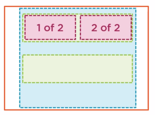
Row and columns go inside of a container.
<div class="container">
    <div class="row">
        <div class="col">
        1 of 2
        </div>
        <div class="col">
        2 of 2
        </div>
    </div>
    <div class="row">
    </div>
</div>

