Css
Introduction
Selectors
Simple Selector
The body is known as the simple selector and the background-color:#cccc99; is the property name and value
body {
    background-color:#cccc99;
}
id Selector
#myid {
    background-color:#cccc99;
}
class Selector
.myClass {
    font-style:italic;
}
You can group selector with a comma.
h1,h2 {
    background-color:#cccc99;
}
descendant selector
This will only effect the
elements below a div tag.
div p {
   background-color:#ddddaa;
}
child selector
This will only effect the child and not descendant
elements below a div tag.
div > p {
   background-color:#ddddaa;
}
<div>
  <form>
    <p>I'm a descendant but not a child</p>
  </form>
  <p>I'm a child</p>
</div>
attribute selector
This will only effect if the attribute matches.
img[alt=spacer] {
   padding:0px;
}
<img src="gradient.jpg" alt="spacer">
psuedo selector
This will only effect if the pseudo is true.
a:visited {color: #dddddd; }
other selectors
There are many other selectors. Here is an example.
ul: li:nth-child(3)
{
   background-color: #cccc99;
}
This sets the 3 child of the list to have background of #cccc99
Specifying CSS Property Values
- keywords
- thing, thick, larger
- Physical measurements
- inches (in), points (pt), picas(pc)
- Screen measurements
- pixels
- Relative measurements
- %, em
- Color codes
- #rrggbb, rbg(r,g,b)
- Fonts
- Helvetica, sans-serif
- Functional notation
- rgb(r,g,b), url("http://test.com")
Cascading and Inheritance
Ordering rules
Rules last applied based on last read. I.E. in this case paragraphs will be Green
p
{
  background-color:Gray;
}

p
{
  background-color:Green;
}
Developer Tools
Chrome shows the user agent stylesheet as well as your stylesheet
CSS Reset Stylesheet
This can be used to reset to styles regardless of browser to reset.
Specificity
This is the number associated with the rule. The highest rule is the rule which is applied.
- A Count of ID selectors
- B Count of class and attribute selectors
- C Count of type selectors
So
*                 /* a=0 b=0 c=0 -> specificity =     0  */
LI                /* a=0 b=0 c=1 -> specificity =     1  */
UL LI             /* a=0 b=0 c=2 -> specificity =     2  */
LI.red            /* a=0 b=1 c=1 -> specificity =    11  */
#content          /* a=1 b=0 c=0 -> specificity =    100 */
Generally a more specific rule takes presidence. In devtools the styles appear in specificity order
Inheritance
Some properties are inherited when you use markup but some are not. Checkout [1] for details
CSS and the Box Model
The Big Three
- Margin (distance from outside to border)
- Border (border itself)
- Padding (distance from border to inside)
Vertical Margins
The vertical margins collapse on top of each other to be the margin of one of the items. E.g. in a list if the list item margin is 5px, the distance between list items will be 5px not 5px for the top item bottom edge and 5px for the item below top edge.
Width
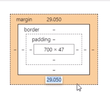
Width is the content size of the item and does not include the margins. Metrics within developer tools shows the calculation.
Display and Visibility
- Display is generally block, inline, or none
- Block elements sit on top of each other
- Inline elements only move downward when there is not enough space
- Display of none removes an element along with the space
- Visibility
- Hidden elements are not visible but reserves the space
Styling Text with CSS
Font Families
CSS defines five font categories
- serif, e.g. Times New Roman
- sans-serif e.g. Arial
- cursive, e.g. Comic Sans
- fantasy, e.g. Impact
- monospace, e.g. Courier New
You use the font-family to specify this. You can specify a list of fonts and it will use the first match
p
{
  font-family:Arial, Helvetica, sans-serif
}
Font Sizes
You can use em which will scale the font from the default. 2em is 2 times the size of the default.
Positioning
Element Types
There are two types of elements, inline and block elements. Inline elements by default position along the line, block elements are stacked
Block Elements
 * <address>
 * <article>
 * <aside>
 * <blockquote>
 * <canvas>
 * <dd>
 * <div>
 * <dl>
 * <dt>
 * <fieldset>
 * <figcaption>
 * <figure>
 * <footer>
 * <form>
 * <h1>-<h6>
 * <header>
 * <hr>
 * <li>
 * <main>
 * <nav>
 * <noscript>
 * <ol>
 * <p>
 * <pre>
 * <section>
 * <table>
 * <tfoot>
 * <ul>
 * <video>
Inline Elements
 * <a>
 * <abbr>
 * <acronym>
 * <b>
 * <bdo>
 * <big>
 * <br>
 * <button>
 * <cite>
 * <code>
 * <dfn>
 * <em>
 * <i>
 * <img>
 * <input>
 * <kbd>
 * <label>
 * <map>
 * <object>
 * <output>
 * <q>
 * <samp>
 * <script>
 * <select>
 * <small>
 * <span>
 * <strong>
 * <sub>
 * <sup>
 * <textarea>
 * <time>
 * <tt>
 * <var>
Relative Positioning
Relative positioning changes the position relatively from where the item would have been.
#buttons input:last-child
{
   position:relative
   top: 20px
   left: 50px
}
Fixed Positioning
Fixed positioning is when you specify the position and it remains in the same place relative to the document in the document when scrolled. Other items ignore fixed items'.
Absolute Positioning
Absolute positioning is when you specify the position and it remains in the same place regardless of when scrolled. Other items ignore absolute items.
Float and Clear
For inline elements float allows other elements to float up against the them. Clear stops this occurring
#figure1
{
   float:left
}
Z Index
The z index controls the order from front to back of the elements. i.e. a z-index as a negative pushes the element to the back. A positive index moves it to the front.
Bootstrep
Quick Stuff
- p-x padding (padding all four)
- m-x margin (padding all four)
- rounded (rounded courners)
Layouts
Containers
Greats a centered squared on your web page. To take up all of the space you can use container-fluid.
Rows And Columns
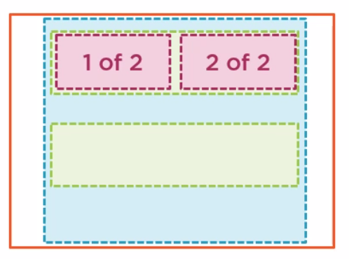
Row and columns go inside of a container.
<div class="container">
    <div class="row">
        <div class="col">
        1 of 2
        </div>
        <div class="col">
        2 of 2
        </div>
    </div>
    <div class="row">
    </div>
</div>
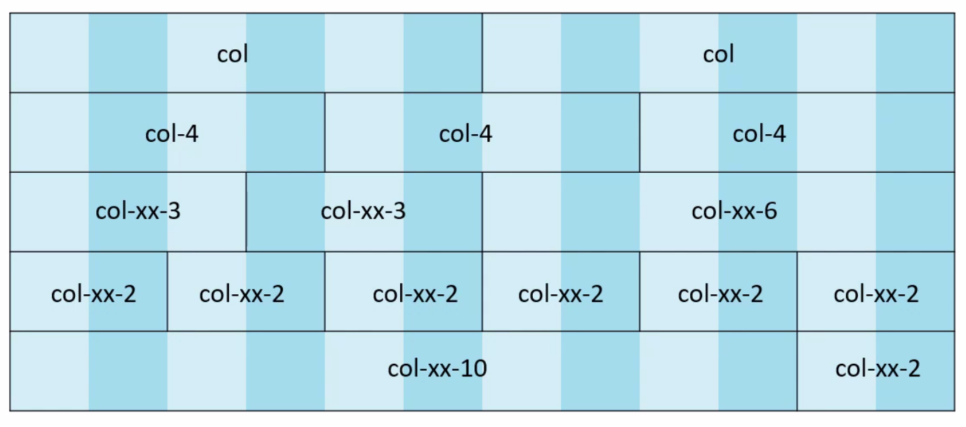
There are 12 columns in a rows
You can use the offset class to leave a gap of a given size between the rows
    <div class="row">
        <div class="col-md-2">
        1 of 2
        </div>
        <div class="col-md-4 offset-md-6">
        2 of 2
        </div>
    </div>
Breakpoints
These are the breakpoints
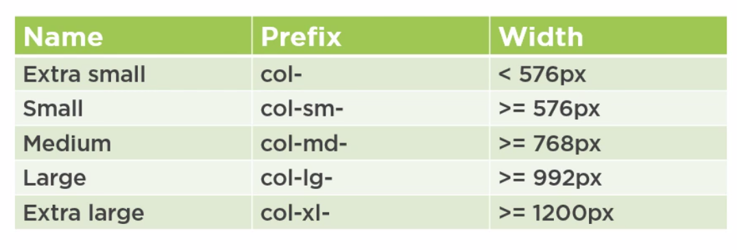
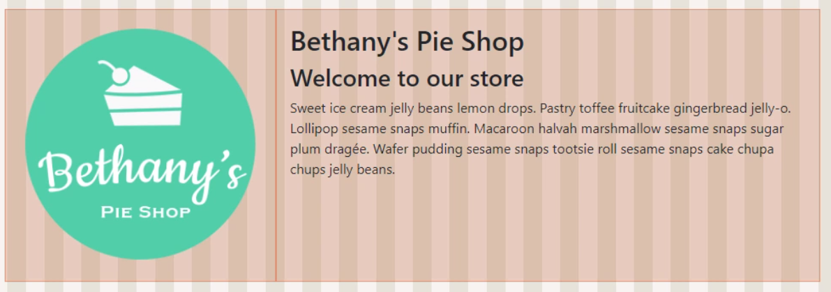
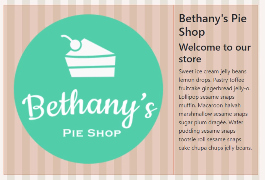
Using the lg (large) we use 4 columns for the logo and 8 for the text. Using sm (small) we reverse this
<div class="row">
    <img src="images/products/applepie.jpg" class="col-lg-4 col-sm-8" />
    <div cla ss="col-lg-8 col-sm-4">
        <h2>Bethany's Pie Shop</h2>
        <h3>Welcome to our store</h3>
        <p>Sweet ice cream jelly beans lemon drops. Pastry toffee fruitcake gingerbread jelly-o.Lollipop sesame snaps muffin. Macaroon halvah marshmallow sesame snaps sugar plum dragée. Wafer pudding sesame snaps tootsie roll sesame snaps cake chupa chups jelly beans.
        </p>
    </div>
</div>
Styles
Text
We can improve text with
- display-n-4, e.g. display-1,display-2
We can align text with
- text-center
- text-left
- text-right
- text-justify
All of the break points can be used, e.g. text-sm-left
Images
We can improve images with
- rounded
- img-fluid (resizes the image to the container)
Tables
Interesting table classes are
- table-striped
- table-hover
- table-bordered
- table-responsive (adds scrollbar to table errr)
Layout
Directional Application
The following can be used with the padding and margins
- l left
- r right
- t top
- b bottom
- x left and right
- y top and bottom
Margins and Padding
To apply margins and padding in bootstrap
- Margins using the m-1 for all or mt-1 for top, mb-1 for bottom, mx-1 for x
- Padding using the p-1 for all or pt-1 for top, pb-1 for bottom, py-1 for y
Components
The nav bar is put in the header tag before the main tag. The fixed-top ensures it remains at the top of the page.
<body>
    <header>
        <nav class="navbar navbar-expand-sm navbar-dark fixed-top bg-dark">
            <div class="container">
...
            </div>
        </nav>
    </header>
    <main role="main">
    </main>
</body>
Modals
We add data-toggle and data-target on html element to create the dialog.
<a type="button" data-toggle="modal" data-target="#IdOfTheModal">Add</a>
For the modal we need to set the role to dialog and class to modal fade. Examples are available on the bootstrap site. The data-dismiss="modal" can be specified on a button to close the dialog.
<div class="modal fade" tabindex="-1" id="IdOfTheModal">
   <div class="modal-dialog">
       <div class="modal-content">
           <button type="button" class="btn btn-secondary" data-dismiss="modal">Close</button>
       </div>
   </div>
</div>
Flexbox
Another Approach
Have great trouble with flexbox (probably dyslexia) so took another approach.
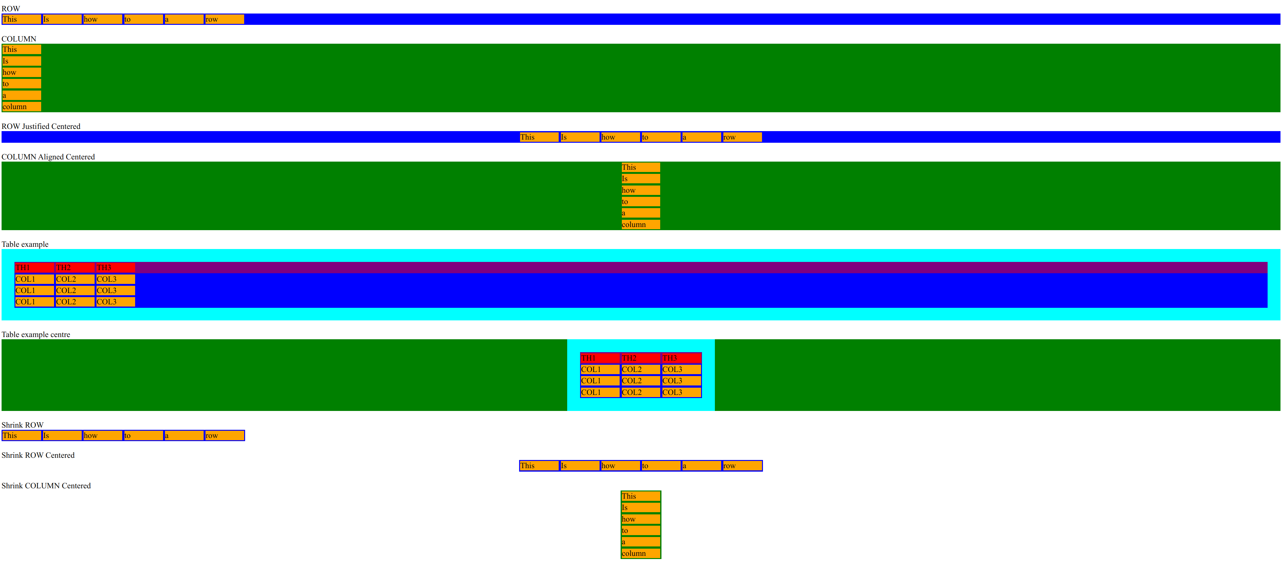
<html>

<head>
    <link rel="stylesheet" href="test.css">
</head>

<body>
    <div>ROW</div>
    <div class="row">
        <div class="item">This</div>
        <div class="item">Is </div>
        <div class="item">how</div>
        <div class="item">to</div>
        <div class="item">a</div>
        <div class="item">row</div>
    </div>
    </br>
    <div>COLUMN</div>
    <div class="col">
        <div class="item">This</div>
        <div class="item">Is </div>
        <div class="item">how</div>
        <div class="item">to</div>
        <div class="item">a</div>
        <div class="item">column</div>
    </div>
    </br>
    <div>ROW Justified Centered</div>
    <div class="row row-centered">
        <div class="item">This</div>
        <div class="item">Is </div>
        <div class="item">how</div>
        <div class="item">to</div>
        <div class="item">a</div>
        <div class="item">row</div>
    </div>
    </br>
    <div>COLUMN Aligned Centered</div>
    <div class="col col-centered">
        <div class="item">This</div>
        <div class="item">Is </div>
        <div class="item">how</div>
        <div class="item">to</div>
        <div class="item">a</div>
        <div class="item">column</div>
    </div>
    </br>
    <div>Table example</div>
    <div class="col">
        <div class="table">
            <div class="row-header">
                <div class="item-header">TH1</div>
                <div class="item-header">TH2</div>
                <div class="item-header">TH3</div>
            </div>
            <div class="row">
                <div class="item">COL1</div>
                <div class="item">COL2</div>
                <div class="item">COL3</div>
            </div>
            <div class="row">
                <div class="item">COL1</div>
                <div class="item">COL2</div>
                <div class="item">COL3</div>
            </div>
            <div class="row">
                <div class="item">COL1</div>
                <div class="item">COL2</div>
                <div class="item">COL3</div>
            </div>
        </div>
    </div>
    </br>
    <div>Table example centre</div>
    <div class="col col-centered">
        <div class="table">
            <div class="row-header">
                <div class="item-header">TH1</div>
                <div class="item-header">TH2</div>
                <div class="item-header">TH3</div>
            </div>
            <div class="row">
                <div class="item">COL1</div>
                <div class="item">COL2</div>
                <div class="item">COL3</div>
            </div>
            <div class="row">
                <div class="item">COL1</div>
                <div class="item">COL2</div>
                <div class="item">COL3</div>
            </div>
            <div class="row">
                <div class="item">COL1</div>
                <div class="item">COL2</div>
                <div class="item">COL3</div>
            </div>
        </div>
    </div>
    </br>
    <div>Shrink ROW</div>
    <div class="container-flex-shrink">
        <div class="row">
            <div class="item">This</div>
            <div class="item">Is </div>
            <div class="item">how</div>
            <div class="item">to</div>
            <div class="item">a</div>
            <div class="item">row</div>
        </div>
    </div>
    </br>
    <div>Shrink ROW Centered</div>
    <div class="container-flex-shrink-centered">
        <div class="row">
            <div class="item">This</div>
            <div class="item">Is </div>
            <div class="item">how</div>
            <div class="item">to</div>
            <div class="item">a</div>
            <div class="item">row</div>
        </div>
    </div>
    </br>
    <div>Shrink COLUMN Centered</div>
    <div class="container-flex-shrink-centered">
        <div class="col col-centered">
            <div class="item">This</div>
            <div class="item">Is </div>
            <div class="item">how</div>
            <div class="item">to</div>
            <div class="item">a</div>
            <div class="item">column</div>
        </div>
    </div>
    </br>

</body>

</html>
And the CSS
.col {
    display: flex;
    flex-direction: column;
    background-color: green;
}

.row {
    display: flex;
    flex-direction: row;
    background-color: blue;
}

.row-centered {
    justify-content: center;
}

.col-centered {
    align-items: center;
}

.table {
    background-color: aqua;
    padding: 1vw;
}

.row-header {
    display: flex;
    flex-direction: row;
    background-color: purple;
}


.item-header {
    margin: 2px;
    width: 3vw;
    background-color: red;
}
.item {
    margin: 2px;
    width: 3vw;
    background-color: orange;
}

.container-flex-shrink {
    display: flex;
}

.container-flex-shrink-centered {
    display: flex;
    justify-content: center;
}
Rows and Columns
Introduction
In bootstrap we saw the way to do this was
<div class="container">
    <div class="row">
        <div class="col">
        1 of 2
        </div>
        <div class="col">
        2 of 2
        </div>
    </div>
    <div class="row">
    </div>
</div>
And that there was a magic number of 12. With flexbox there is no magic number and we can have as many as we like.
	<div class="d-flex flex-row" style="background-color: yellow;">
		<div style="background-color: green;" class="col">New Test 1 of 2</div>
		<div style="background-color: orange;" class="col">New Test 2 of 2</div>
	</div>
We can stack the boxes horizontally. We add the d-block class to denote that it is a block element i.e. it cannot have elements wrapped on to it.
	<div class="d-flex flex-row" style="background-color: purple;">

		<div class="d-flex flex-column" style="background-color: green;">
				<img src="images/mountain_Blue.png" class="d-block">
				<h3>Climbing</h3>
				<p>I love this</h3>
		</div>

		<div class="d-flex flex-column" style="background-color: green;">
			<img src="images/mountain_Blue.png" class="d-block">
			<h3>Climbing</h3>
			<p>I love this</h3>
		</div>

		<div class="d-flex flex-column" style="background-color: green;">
			<img src="images/mountain_Blue.png" class="d-block">
			<h3>Climbing</h3>
			<p>I love this</h3>
		</div>
	</div>
In the tutorial they used css to define the bootstrap sizes by simple creating classes and applying them to the html
.w-60{
	width: 60%!important;
}

.h-30{
	width: 30%!important;
}

.w-20{
	width: 20%!important;
}
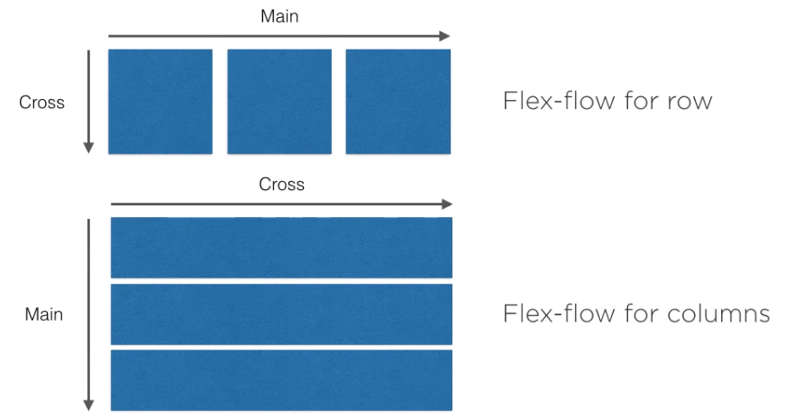
Main Axis and Cross Axis
When looking at the documentation and you see main or cross you need to take into account whether you are dealing with columns or rows.
Alignment And Layout
Alignment
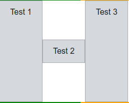
The self refers to item within a group. So given the html
	<div class="d-flex flex-row testRow">
		<div class="testBox">Test 1</div>
		<div class="testBox align-self-center">Test 2</div>
		<div class="testBox">Test 3</div>
	</div>
The text box is aligned within the row of items.
Grow Shrink Fill
The flex-grow, flex-fill and flex-shrink allow the row components change size
	<div class="d-flex flex-row testRow">
		<div class="testBox">Test 1</div>
		<div class="testBox">Test 2</div>
		<div class="testBox flex-fill">Flex Fill</div>
	</div>

	<div class="d-flex flex-row testRow">
		<div class="testBox">Test 1</div>
		<div class="testBox flex-grow-1">Flex Grow</div>
	</div>
Auto Margins
We use auto margins to push out other controls based on the directional suffix
	<div class="d-flex flex-row testRow">
		<div class="testBox">Test 1</div>
		<div class="testBox ml-auto">Test 2</div>
		<div class="testBox">Test 3</div>
	</div>
Breakpoints
The breakpoints can now be added to the css use the media query.
.banner{
	height: 150px;
	background-image: url('../images/shutterstock_116403520.jpg');
	background-size: cover;
	background-position: center -100px;
}

@media (min-width: 576px) {
	.banner{
		height: 200px;
	}
}

/*Medium devices (tablets, 768px and up)*/
@media (min-width: 768px) {
	.banner{
		height: 300px;
	}
}

/*Large devices (desktops, 992px and up)*/
@media (min-width: 992px) {
	.banner{
		height: 400px;
	}
}

/*Extra large devices (large desktops, 1200px and up)*/
@media (min-width: 1200px) {

}
CSS Transitions
Introduction
Transitions need two elements property and duration. http://codepen.io is a excellent site to practice.
- transition-property the property you want to transition. Not all things are transitionable. ggo.gl/Ttk1S2
- transition-duration in seconds or milliseconds
- transition-time-function for the transition optional
- transition-delay how long to delay the transition
Kicking a Ball
Details were at http://cdpn.io/fGFDj
.paw {
  transition: transform .25s ease-in;
}

.playing .paw {
  transform: translateX(30px);
}

.paw {
  position: absolute; top: 0; left: 80px;
}

.ball {
  background: #0097C0;
  border-radius: 50%;
  position: absolute; top: 200px; left: 160px;
  width: 100px; height: 100px;
}

body { background: #e3edf2; }
And the HTML
<!--HTML: Use these classes for reference!-->
<div class="ball"></div>
<img class="paw" src="https://s3.amazonaws.com/stash.rachelnabors.com/codepen/css-animation-workshop/paw.png" />
And the JavaScript
$(window).on('load', function(){
  $("body").addClass("playing");
});
Multiple Properties
Crappy format
transition-property: color, transform
transition-duration: 2s, 300ms
transition-delay: 0, 1s
Good format
transition:
  color 2s,
  transform 300ms 1s
Duration Of Animations
Recommended sweet spot is 250-300ms - Not much more to say, 1 second is the top end.
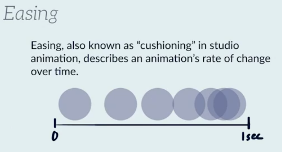
Easing
- Timing Functions
- ease-out
- ease-in
- ease-in-out
- linear
- cubic-bezier
See http://cubic-bezier.com is a good site to make these.
transition-timing-function: ease-in
// Or
transition-timing-function: cubic-bezier(0.445, 0.05, 0.55, 0.95)
CSS Animations
Introduction
- animation-name the name of the keyframe block you want to use
- animation-duration how long the animations takes to go from 0% to 100%
- animation-iteration-count the number of times you want to go from 0% to 100%; use infinite to never stop. Default to 1
- animation-timing-function like transition-timing-function
- animation-delay like transition-delay
- animation-fill-mode can be backwards or forwards, both or none
.animated-thing {
 animation: black-to-white 1s linear 1
}

@keyframes black-to-white {
  0% { background: #000; }
  100% { background: #fff; }
}

/* Or in full */
.animated-thing {
   animation:
     $name
     $duration
     $timing-function
     $animation-delay
     $iteration-count
}
Making a Walk-Cycle
Nice intro to this and code at cdpn.io/cdqga
<div class="tuna"></div>

<p>You can do it!</p>
And the JS
.tuna {
  /* use the timing function steps() to chunk the animation into 12 equal pieces */
  background: url(http://stash.rachelnabors.com/animation-workshop/sprite_catwalk.png) 0 0 no-repeat;
  height: 200px;
  width: 400px;
  margin: 100px auto 0;
}

/* Don't forget: You'll need an @keyframes block to change the background image's position! */
p {text-align: center;}
With the sprite at [[2]]
Animation Design
Liked this.
- Jump cuts when you move from on state to another without a transition. E.g. In the movies with no fade out/fade in
- In betweening this is the things you put between frames to perform a transition. E.g. in cartoons drawing the movements between step 1 and step 2
Sensing Visual Play Readdiness
Nice example on this at http://cdpn.io/JDcwI
<!-- swap the .loading class with .loaded using JavaScript, manipulate visibility with CSS -->

<div id="stage" class="loading">
  <div class="loader">
    <div class="rollout">
      <img src="https://s3-us-west-2.amazonaws.com/s.cdpn.io/641/yarnball.svg" class="yarn" />
    </div>
    <div class="loading-text">Loading</div>
  </div>
  <div class="scene window">
    <div class="tail"></div>
  </div>
</div>
And the JS
$(window).load(function(){
  setTimeout(function(){
      // use .addClass() and .removeClass() to swap the loading class for loaded on #stage.
    }, 6000);
});
And the CSS
/* Set transitions on both .loader and .scene */
.loader, .scene {
}

/* See how their opacity is 0 when loaded or loading? No more CSS edits needed below. */
.loaded .loader, .loading .scene {
  opacity: 0;
}

/* Loader CSS */
.loader {
  position: absolute;
  width: 100%;
  top: 50%;
  transform: translateY(-50%);
}

.loading-text { font-size: 3em; }

.rollout {
  background: url(https://s3-us-west-2.amazonaws.com/s.cdpn.io/641/strand.svg) no-repeat 0 50%;
	background-size:400px 24px;
	height: 40px;
	position: absolute; left: 50%; margin-left: -200px;
	animation: unrolling-strand 6s cubic-bezier(.57,.27,.46,.79) infinite forwards;
	width: 0;
}

@keyframes unrolling-strand {
	60% {
		opacity: 1;
		width: 400px;
	}
	70% {
		opacity: 0;
		width: 400px;
	}
	100% {
		opacity: 0;
		width: 400px;
	}
}

.loading-text {
	animation: loading-fadein 6s cubic-bezier(.57,.27,.46,.79) infinite forwards;
	opacity: 0;
	text-align: center;
}

@keyframes loading-fadein {
	65% { opacity: 0; }
	82.5% { opacity: 1; }
	100% { opacity: 0; }
}

.yarn {
  animation: rolling-yarn 6s cubic-bezier(.57,.27,.46,.79) infinite forwards;
  position: absolute;
  right: -20px; top: 0;
  width: 40px;
}

@keyframes rolling-yarn {
  60% { transform: rotate(1146deg); }
  100% { transform: rotate(1146deg); }
}

/* Window CSS */
.window {
  background: url("https://s3-us-west-2.amazonaws.com/s.cdpn.io/641/tuna-window.png") no-repeat 0 0;
  background-size: 100% auto;
  padding-top: 81.38%;
}

.tail {
  animation: tailWag steps(5) .5s alternate infinite forwards;
  background: url(https://s3-us-west-2.amazonaws.com/s.cdpn.io/641/tuna-tails.png) 0 0 no-repeat;
  background-size: 100% auto;
  width: 40%;
  padding-top: 18.63%;
  position: absolute;
  top: 75%;
  left: 16%;
}

@keyframes tailWag {
  0% { background-position: 0 0; }
  100% { background-position: 0 125%; }
}

body {
  background: #c0c0c0;
  font-family: Crafty Girls, cursive;
  font-size: 14px;
  text-align: center;
}

#stage {
  position: absolute;
  top: 50%; left: 50%;
  transform: translate(-50%, -50%);
  width: 60%
}
Some JS libraries
- Waypoints
- Scrollr
- GSAP
Performance
Resources
Excellent site for performance is https://csstriggers.com/ Training devtoolschallenger.com
Will-change
This usuage of CSS moved work to the GPU and should not be used
.resource-sink {
   transform: translateZ(0);
}

We can not use
.in-view .animated-thing {
   will-change:transform
}

.inview .animated-thing:hover {
   transform: translateY(5%)
}
DevTools
Stuff
In the console you can enter javascript so modify the DOM. Note the DOM is not the source. e.g.
document.body.appendChild(document.createElement('h3'));
document.querySelector('h3').innerText = "Testing";
Search
- use Inspect
- ctrl+f in devtools
- use point top left of devtools
Colors
- Orange is margin
- Green is padding
Styles
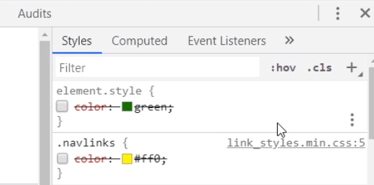
- The Styles pane shows the styles cascading from bottom (defaults) to the top (latest)
- The Computed pane shows just what has been applied for an element
- The format button on the bottom on devtools (not shown) lets you unminify style sheets
- The element states can be set using the :hov next to the filter button
- The element.style box allows you to enter a style for the current element
You can dynamically change the margins, padding border by double-clicking
JavaScript Console
- console.dir Json format
- console.table for table format
- console.assert e.g. console.assert(data.length === 15, {'stuff':'tooutput'})
- console.trace()
To output to the console with a label and not expanded
console.groupCollapsed(`my stuff`)
console.log('many lines 1')
console.log('many lines 1000')
console.groupEnd()
Devtools Console
Introduction
You can add functions to objects selected in the Elements tab in the devtools console. $0 to $4 in the console will show which object is assigned to which variable. For example
function logEvent(event) {
  console.log(`An event occurred: ${event.type}`)
}

$0.addEventListener(`click`, logEvent);
Monitor and Debug
Monitor can be used to get console alert when a function executed. For example
monitor(logEvent);
debug(logEvent) stops the code on the first line of function
Live Expressions
These can be created in the console and will be pinned to the top of the console so you can monitor values changing.
Debbugger
- Log Points allow output of variables to the console. Right-client and type 'stuff', myvar and it will log to the console
Resources
- ctrl+shift+p command line
- https://developers-google.com/web/tools-devtools

