Android Layouts
Introduction
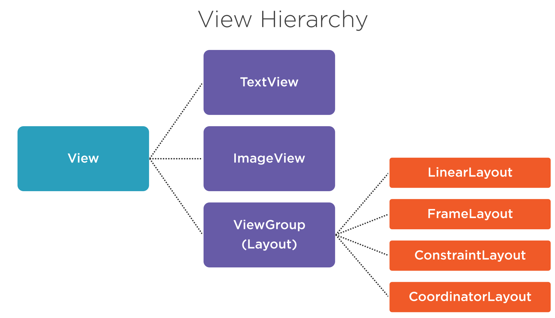
View Hierarchy can be split into types types
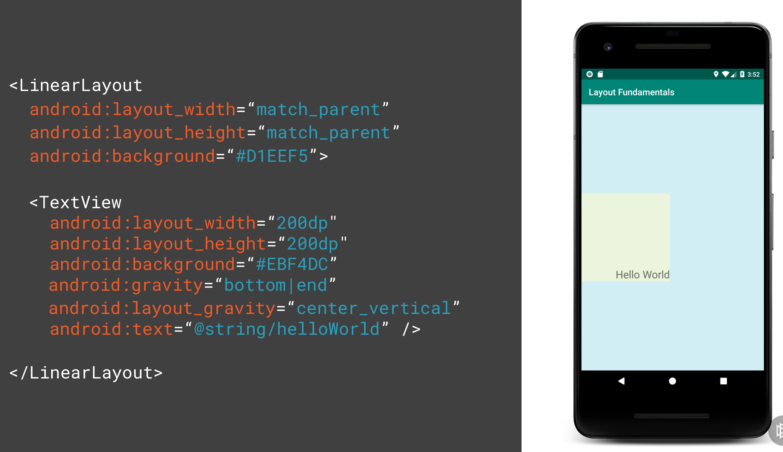
- Margin is the space around the widget
- Padding is the space within the widget
- Gravity is the position of the widget within the widget its self
- Layout Gravity is the position of the widget within its parent
Here shows the difference between layout_gravity and gravity.
Basics
Screen Sizes
Measured in inches diagonally across the screen
- Small 2 to 3.7"
- Normal 3.7 to 4.3"
- Large 4 to 7"
- Xlarge 7 to 10"
Screen Resolution
- Quarter HD 960 × 540
- Half HD 720 x 1280
- Full HD 1080 x 1920
- Ultra HD 3840 x 2160
Screen Densities
Number of dots per inch (dpi).
- Low LDPI ~120
- Medium MDPI ~160d
- High HDPI ~240
- Extra High XHDPI ~320
- XX High XXHDPI ~400
- XXX High XXXHDPI 640
Pixel Terminology
- Pixel px
- Device Independent Pixel dip or dp
- Scale Independent Pixel sp Used with TextView size only
Note sp considers the user preferences on top of dp i.e. if we want large fonts on our device.
Calculating Value
Here is the formula to calculate the pixel for a given dp and DPI
px = dp * (dpi /160)
And here is the Golden rule for Scaling for different DPI
| DPI | Ldpi | mdpi | hdpi | xhdpi | xxhdpi | xxxhdpi |
| Scale Factor | .75x | 1x | 1.5x | 2.x | 3x | 4x |
Android Studio Folders
Configuration Qualifiers
There are several folders in Android Resource
- res/mipmap [-mdpi, -hdpi, -xhdpi, -xxhdpi]
- To store launcher icons
- res/drawable [-mdpi, -hdpi, -xhdpi, -xxhdpi]
- To store image resources
App Launcher Icon Dimensions
| MDPI | 48px |
| HDPI | 72px |
| XHDPI | 96px |
| XXHDPI | 144px |
| XXXHDPI | 192px |
Image Resource Dimensions
Taking a 100px image the resource across the Densities might be.
| MDPI | 100px |
| HDPI | 150px |
| XHDPI | 200px |
| XXHDPI | 300px |
| XXXHDPI | 400px |
Layouts
For layouts we can have
- res/layout/my_layout.xml default
- res/layout-large/my_layout.xml large
- res/layout-xlarge/my_layout.xml extra large
- res/layout-xlarge-land/my_layout.xml extra large in landscape
- res/layout-sw600dp/my_layout.xml For 7" tablets (600dp wide)
- res/layout-sw720dp/my_layout.xml For 10" tablets (720dp wide)
- res/layout-w600dp/my_layout.xml For Multi-pane (any screen > 600dp width)
Some qualifier terminology
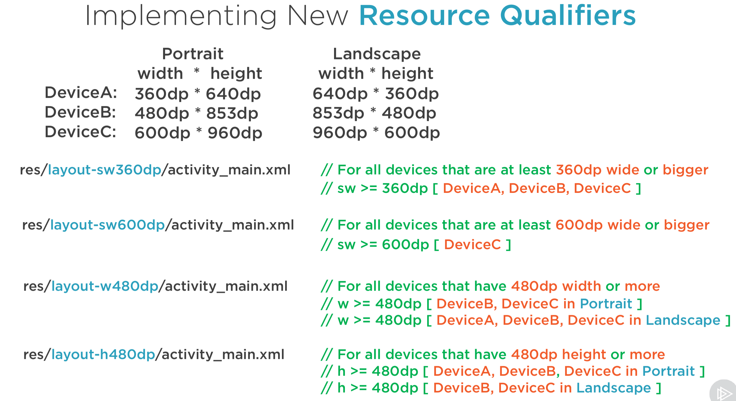
- sw smallest possible width/height in any orientation
- w available width in a given orientation
- h available h in a given orientation
Example of working this out for 3 Devices.
Layouts At Runtime
Introduction
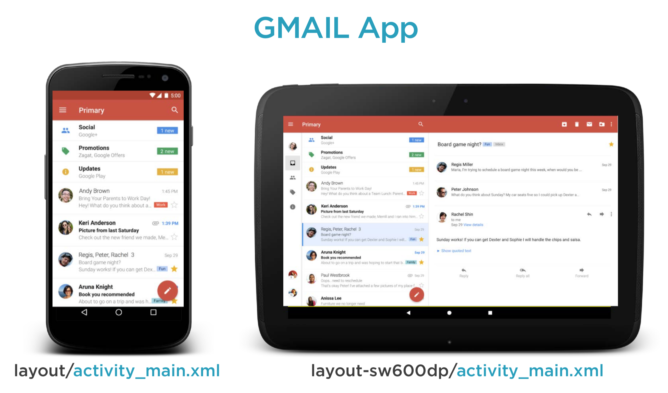
We can create layouts which meet the need to the different devices in different layout folder. For example Gmail uses a different layout on the tablet compared to the phone
Layout Implementation
In the layout implementation we create two layouts. The layouts are
- layout/activity_main.xml
- layout-sw600dp-landscape/activity_main.xml
Here is the code for the landscape activity.
  <LinearLayout
    xmlns:android="http://schemas.android.com/apk/res/android"
    xmlns:tools="http://schemas.android.com/tools"
    android:layout_width="match_parent"
    android:layout_height="match_parent"
    android:orientation="horizontal">
    <fragment
        android:id="@+id/fragmentA"
        android:name="nz.co.bibble.fragments.ListFragmentA"
        android:layout_width="0dp"
        android:layout_height="match_parent"
        android:layout_weight="1"
        tools:layout="@layout/fragment_a_list"/>
    <fragment
        android:id="@+id/fragmentB"
        android:name="nz.co.bibble.fragments.DetailFragmentB"
        android:layout_width="0dp"
        android:layout_height="match_parent"
        android:layout_weight="2"
        tools:layout="@layout/fragment_b_details"/>
 </LinearLayout>
Code Implementation
In the Activity onCreate function we check for the presence for the fragmentB. If it is not there then we are either on a small phone or not in landscape orientation.
	FragmentManager fragmentManager = getFragmentManager();
        detailFragmentB = (DetailFragmentB) fragmentManager.findFragmentById(R.id.fragmentB);

	View fragmentBView = findViewById(R.id.fragmentB);
	mIsDualPane = fragmentBView != null && fragmentBView.getVisibility() == View.VISIBLE;
And in the displayDetails function have an if/else to manage whether to pass the detail to the fragment or start a new activity.
    @Override
    public void displayDetails(String title, String description) {

	if (mIsDualPane) { // If we are in Tablet
  	    detailFragmentB.displayData(title, description);
	} else { // When we are in Smartphone
	    Intent intent = new Intent(this, DetailActivity.class);
		intent.putExtra("title", title);
		intent.putExtra("description", description);
		startActivity(intent);
	    }
	}
Alternative Implementation
We can use aliases via the res/values-xxxx folders. If we have three folders like below
- values/my_layout.xml
- values-sw600dp-land/my_layout.xml
- values-sw600dp-port/my_layout.xml
And they contain the same key but different values we can then implement our code based on the key values read from the values folder.
 <resources>
 <item name="main_layout" type="layout">@layout/dual_pane</item>
 <bool name="is_dual_pane">true</bool>
 </resources>
We can now implement this in the activity with
//		View fragmentBView = findViewById(R.id.fragmentB);
//		mIsDualPane = fragmentBView != null && fragmentBView.getVisibility() == View.VISIBLE;

		mIsDualPane = getResources().getBoolean(R.bool.is_dual_pane);
Layouts
Linear Layout
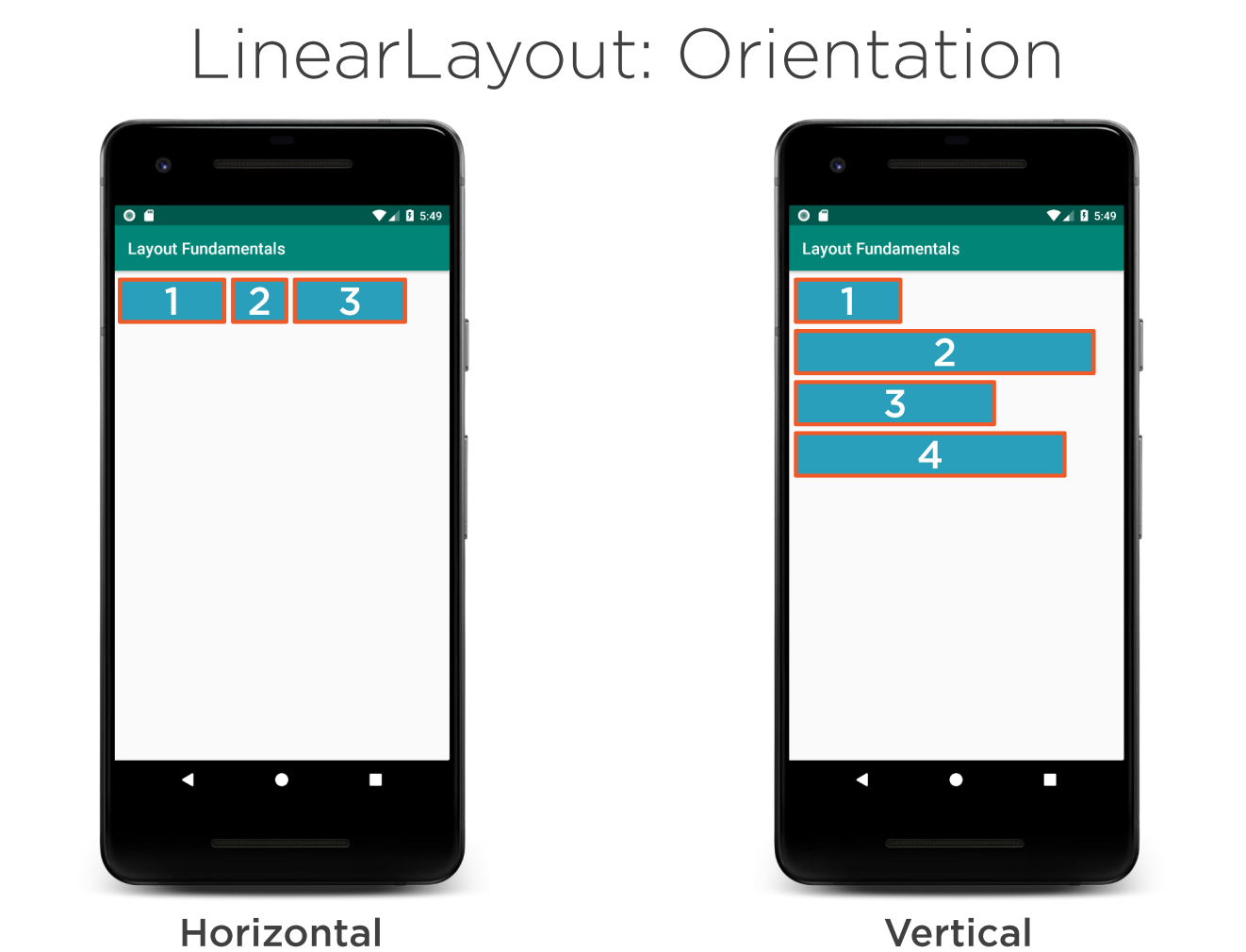
These are like rows and columns in flex box. Items are wapped.
Weight
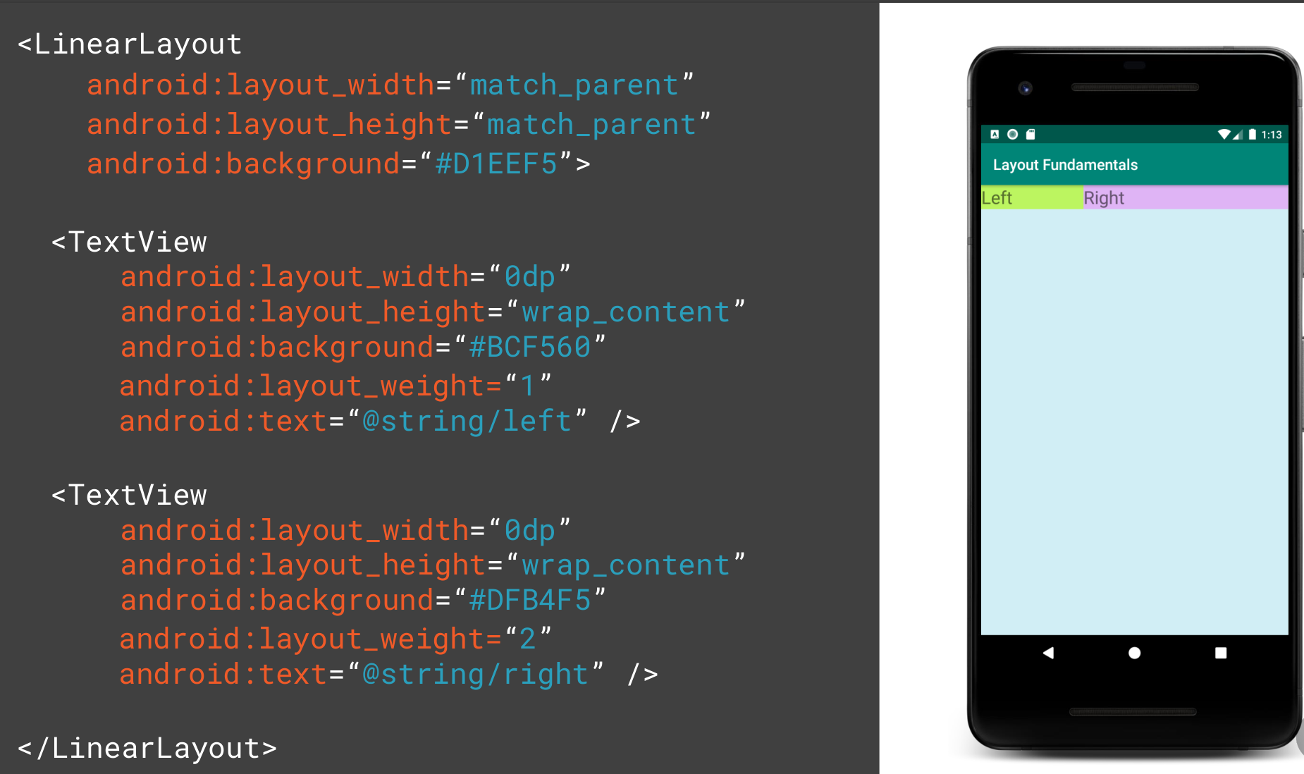
Weight determines the distribution of the widgets when no width or height is provided. Here the weight adds up to 3 and therefore the ratio is 1:2
FrameLayout
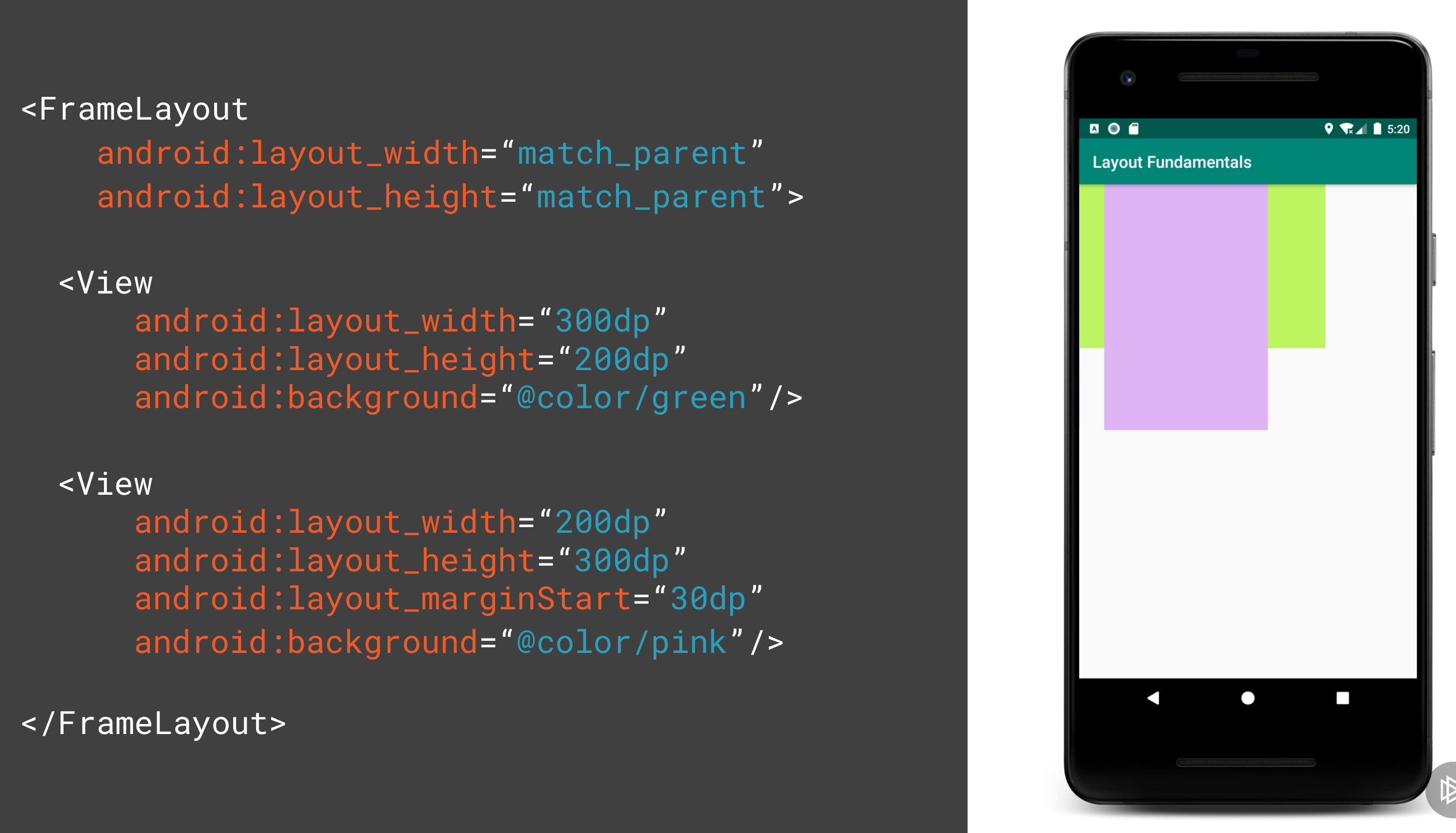
This allows you to put a layout on top of another. E.g. you want of put text on top of a picture.
Coordinated Layout
Intended for two primary use cases
- As a top level application decor or chrome-layout
- As a container for a specific interaction
- With its child views
- Between its child views
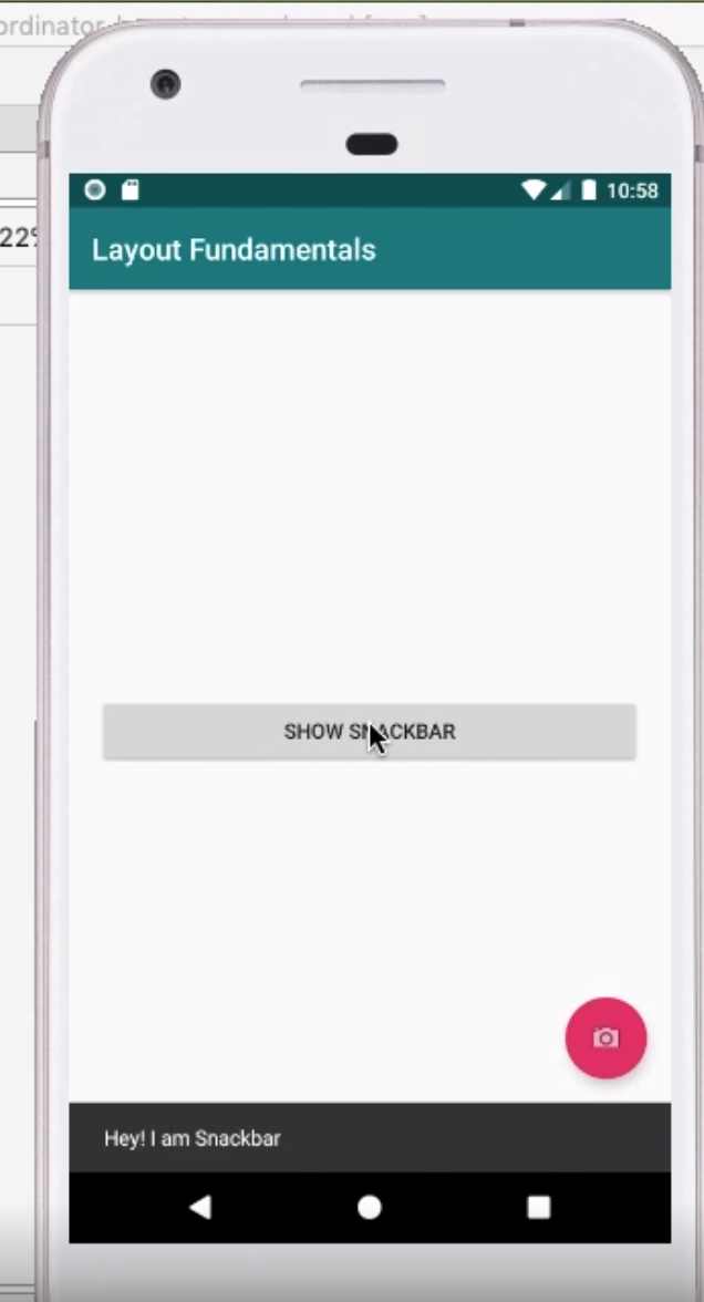
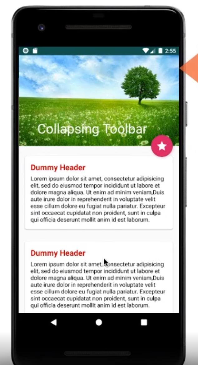
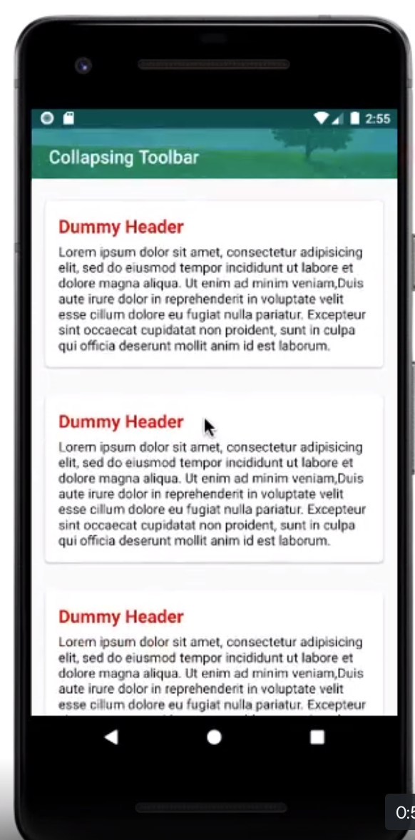
This can be used as parent which will allow other components such as the FAB button to move when the SnackBar appears. The example of collapsing toolbar was very impressive.
Constraint Layout
Introduction
- Released in 2016
- Compatible with API 9+
- Can be used for animations
- Flat hierarchy so no nested layouts (better performance)
- Provides relative positioning
- You can use drag and drop in Visual Studio
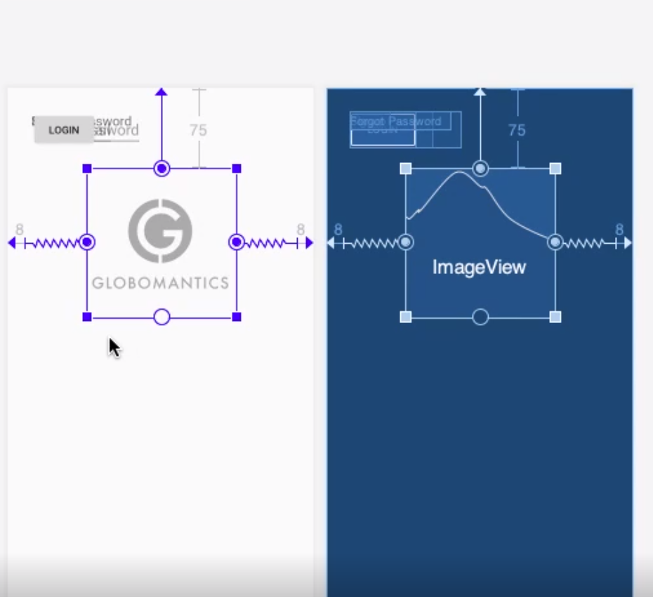
When you use android studio you can convert existing layouts in the component tree by right clicking. This does not always work but is an option. By using the Android Studio Editor you can drag the constraints to the sides so constrain the widget.
Guidelines
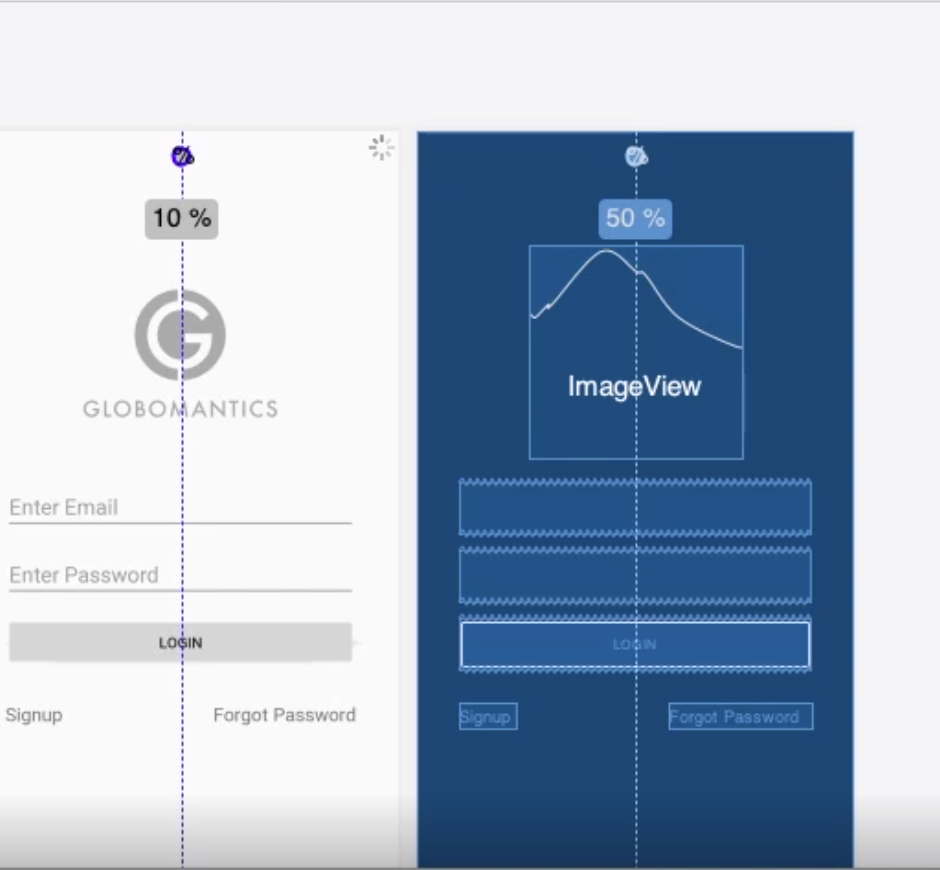
You can add Guidelines to attach to for extra constraints. e.g. for dividing a layout by 50%. These do not show to the user. These can be used to set margins left, right, top and bottom so we do not need to set them on the widgets we add.
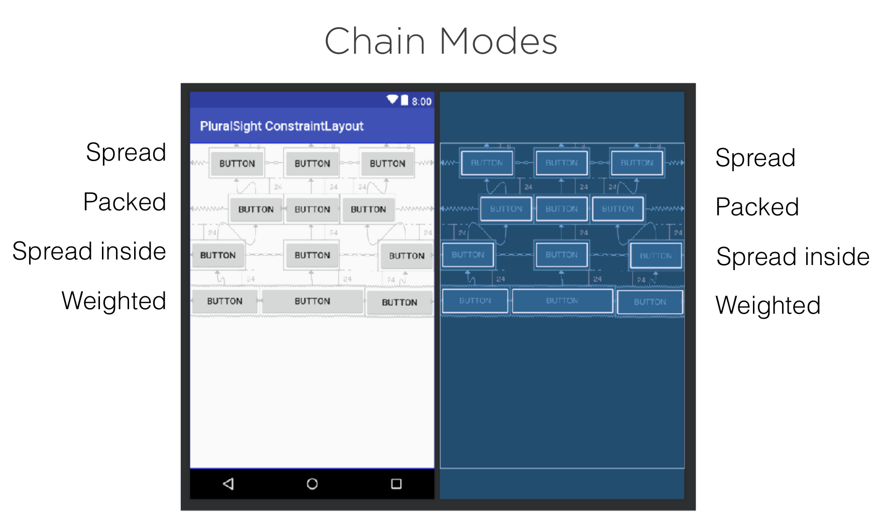
Chain Modes
For reference here are the different Chain modes
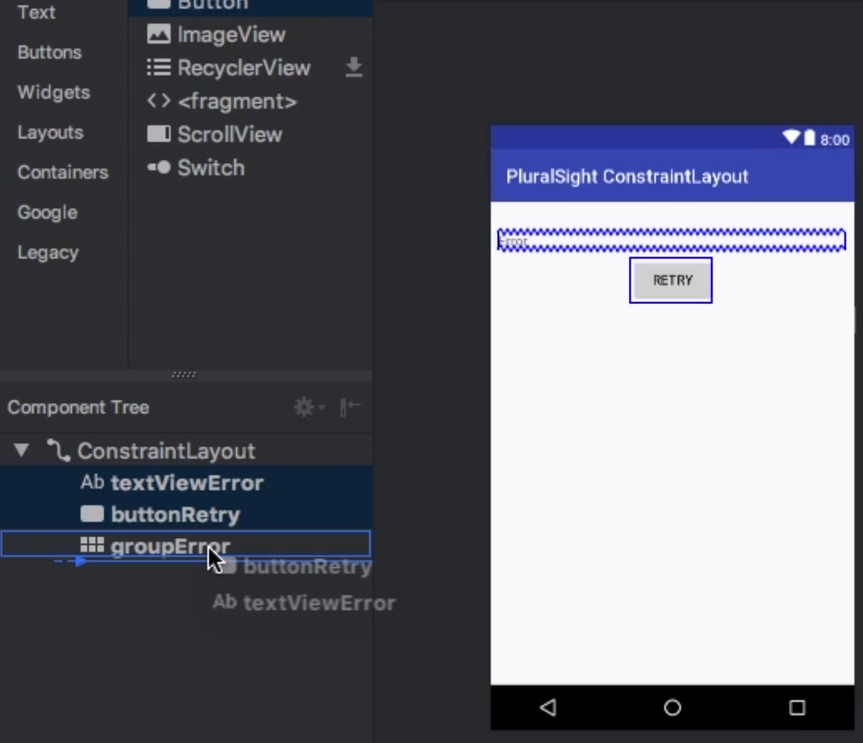
Groups
We can use a group to reference a set of ids. This allows us to set visibility using the group id rather than setting it on each widget.
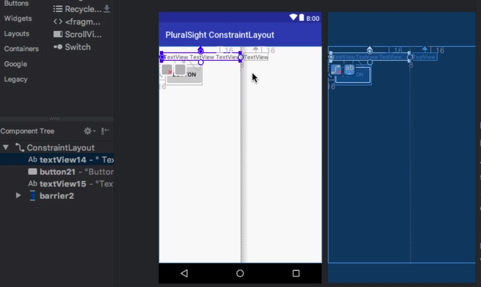
Barriers
Similar to groups we can associate a group of widgets with a barrier. In the example below the text box has grown in size on the left. With the barrier the other text box has moved to accommodate. Without a barrier this would be overlayed.
Layout Inspector
This is the equivalent of DevTools for the web. You can view the details at runtime of the layout. The main use case would be for non static (dynamic) layouts, fragments etc.
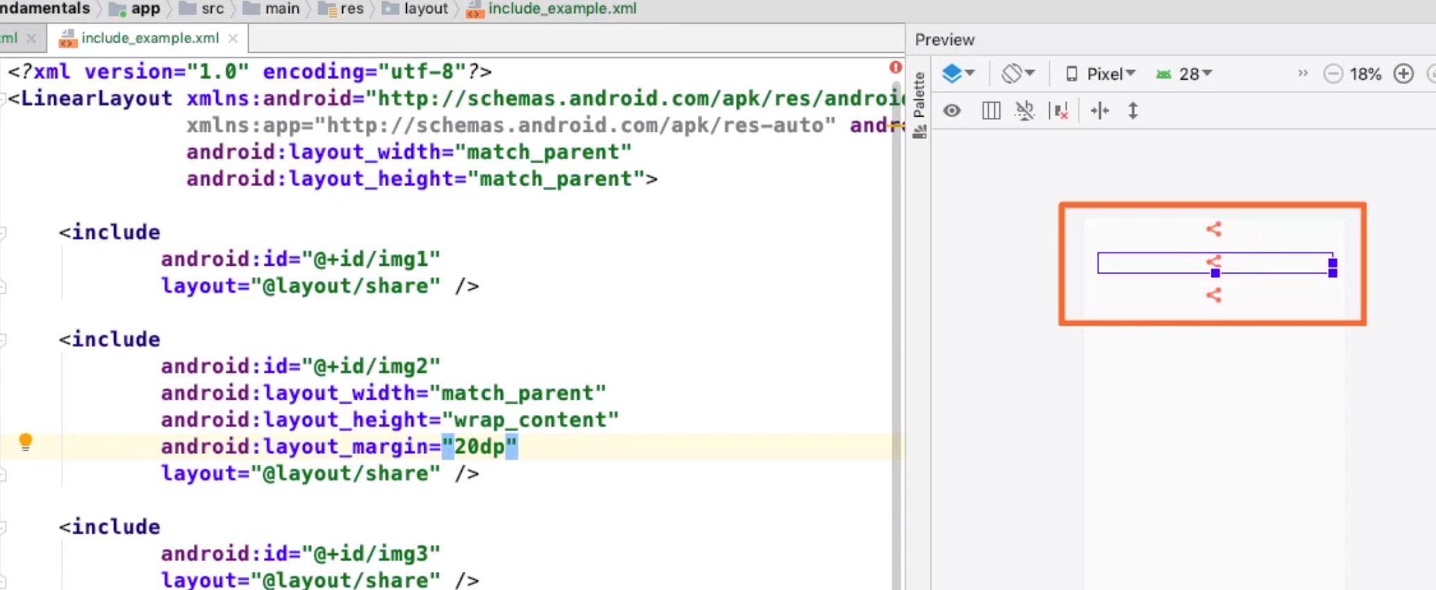
Include Files
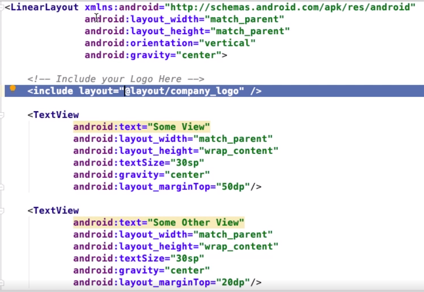
If you want to repeat layouts you can use include. This will get the layout specified in the layout attribute. Note you can override attributes but you must remember to specify the layout_width and layout_height.Note only properties with layout_ can be override.
Merge
Sometimes when we include files they already have a layout as a parent. We can use the Merge tag to combine the layout instead. This makes the children become child of the parent layout rather than the LinearLayout (in this case) be embedded.
Android Layouts In Subfolders
By default all of the layouts are in a folder called layouts under res. There are a few sites showing you how to do this but there seemed to be issues with this for me so I am documenting it here in case I forget. Key points for me were
- I removed the original layout directory
- I created a layouts directory at the same level as the original layout directory
- I created a sub-folder called layout under each feature folder
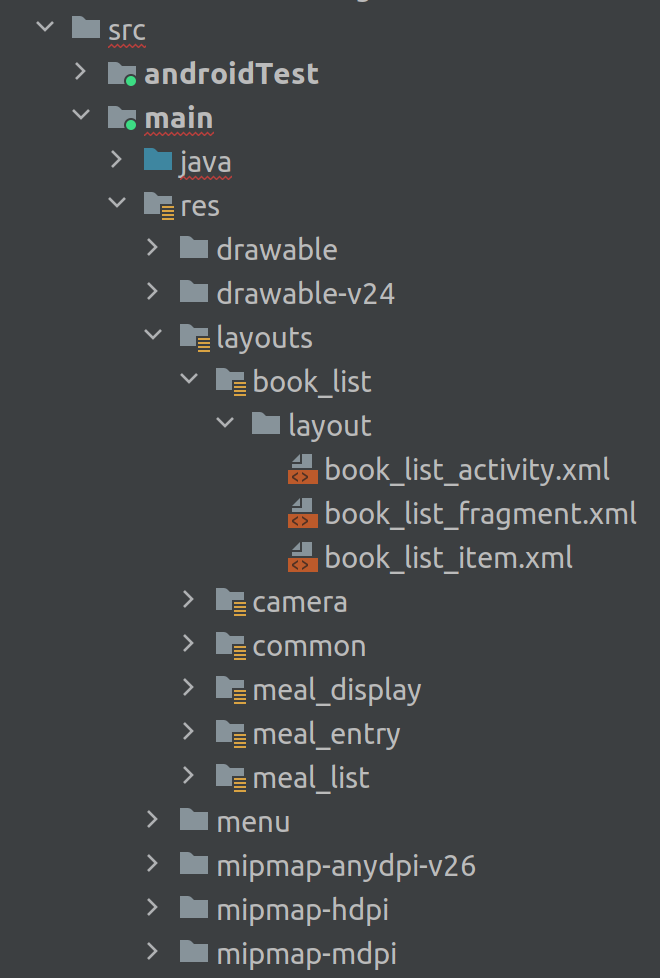
There was a lot of examples for the next part but the key points seemed to be
- Add this to the project build.gradle
- Make sure the last two directories are as shown i.e. last and second-to-last (some do not say this)
- Make sure the sourceSets is under android
android {

    sourceSets {
        main {
            res.srcDirs = [
                    "src/main/res/layouts/book_list",
                    "src/main/res/layouts/camera",
                    "src/main/res/layouts/common",
                    "src/main/res/layouts/meal_display",
                    "src/main/res/layouts/meal_entry",
                    "src/main/res/layouts/meal_list",
                    'src/main/res/layouts',
                    'src/main/res/layout',
                    'src/main/res'
            ]
        }
    }
....